Faces of Politics
Posted by ben on 21 May 2008 at 04:40 pm | Tagged as: design, politics
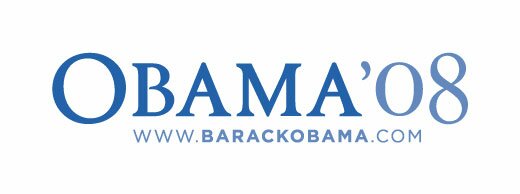
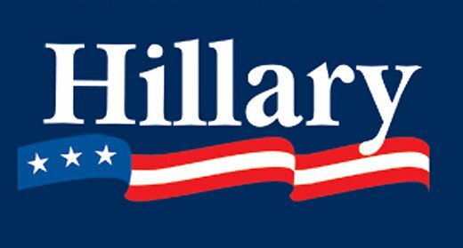
A few days ago Andrew Sullivan reposted an analysis of presidential candidates’ font choices written by and based on a segment that aired on ABC. As discussed in these pieces, Obama uses Gotham, which is a very new font based on an old sign at the New York Port Authority Bus Terminal. Hillary uses Baskerville, designed in 18th century England and popularized in America by Benjamin Franklin. McCain uses Optima, which was created by prolific German type designer Hermann Zapf in the 1950s. But there’s a bit more to this.

First off, as Design Info notes, the typefaces Obama generally uses for his word marks are not Gotham. One word mark uses Perpetua, released in 1929 by Monotype; the other uses, as far as I can tell, a bold version of Requiem, designed by Hoefler & Frere-Jones, the creators of Gotham. (Although Hoefler & Frere-Jones don’t offer a bold version of Requiem, so maybe that’s not it.) Gotham was originally designed for a commission for GQ, which wanted a strong masculine font that felt traditional yet contemporary. Requiem is based on a face found in a Renaissance writing manual, and, according to the creators, “celebrates the fertile world of Renaissance humanism.” Perpetua was designed by Eric Gill, a stone cutter who saw Perpetua as a rational, humanist type for the 20th century. This is a complex mixture of type decisions, but I think it all boils down to a set of progressive, rationalist types that convey strength.

Hillary’s choice, Baskerville, is also a rational, neoclassical face created by British printer John Baskerville, a vocal atheist. Oddly enough, his magnum opus was the “Baskerville Bible,” printed for Cambridge press. Baskerville created only a small edition of this Bible, for which he created the ink and paper, as well as using his own typeface. Hillary’s choice in using this font is, I think twofold. First of all, it has historical roots in revolutionary America, where it was championed by Benjamin Franklin, a friend of Baskerville’s. Second, its use today is somewhat academic (its use was revived by Harvard University Press in 1917), and lends Hillary’s campaign the wonky character that she worked so hard to develop before ditching it for gritty populism sometime between the primaries in Ohio and Pennsylvania.

John McCain’s choice, Optima, was designed by Hermann Zapf, a German designer who modeled it after Roman inscriptions. I actually think the McCain campaign’s choice here was fairly straightforward: Optima is used for the engravings on the Vietnam Memorial. Since McCain’s campaign is largely based around his military experience, this choice makes sense.
Extra Bonus Link: the designers of Obama’s font choices Gotham and Requiem make fun of McCain’s and Clinton’s font choices.
The phallus and the infinity symbol compel the viewer to rise above or to sink below their flat planes to enjoy their evocative swellings
This is fascinating stuff. I wrote a brief post about this a few months ago here. I discovered your site from one of our writers,
.
It is a small world. We’re a group of academics in Denmark but I’m originally from SA, Beauregard and Madison. I keep telling people about the great little art scene in SA. Keep up the great work. Terrific blog, will be added to my personal blog role.
The challenge for this month’s project is to paint something lit only by candlelight
We Have Always Done It That Way
These are beautiful, technically, thematically, and conceptually. Thank you for allowing the click-to-enlarge option, which really helped. Works on paper often do not fare well in the translation to the screen, but these images were fab, right down to the deckled edges of the paper itself.