May 2008
Monthly Archive
Monthly Archive
Posted by ben on 31 May 2008 | Tagged as: acquisitions, announcements, arts organizations, design, rumors, sneak peeks
A few days ago Dan Goddard posted some interesting details on the museum that will house the contemporary art collection of Linda Pace:
By this fall, the foundation expects to select a site in San Antonio for the construction of a permanent home for Pace’s contemporary art collection, including works by Willem de Kooning, Olafur Eliasson, Isaac Julien, Richard Tuttle and Rachel Whiteread. British architect David Adjaye, who designed the Museum of Contemporary Art in Denver, is working on the project.
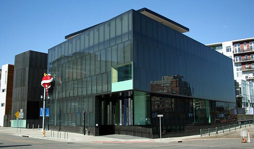
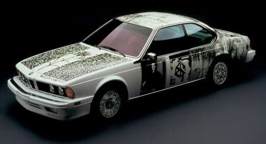
Some are anticipating that the museum, when completed, will be as important as the Menil in Houston (we’ll see…). Adjaye has already created a model for the museum which was sort of viewable through the glass of a locked office door in the Linda Pace Foundation offices during an event last night. I just caught a quick glimpse, but the model seemed less boxy than some of Adjaye’s more well-known projects, such as the Museum of Contemporary Art in Denver (above).
An exhibit of Adjaye’s work will be traveling to the Hudson (Show)Room at Artpace in September. The show, organized by London’s Whitechapel Art Gallery, is called “Making Public Buildings” (a catalog is ). As usual with Hudson shows, Adjaye will be giving a walk-through at the opening on September 11. In addition to high-end London homes and public buildings such as museums and libraries, Adjaye has collaborated with artists Olafur Eliasson (see here) and Chris Ofili (see here) on projects that blur the line between visual art and architecture. Adjaye’s buildings are noted for their experiential sensitivity and their ability to respond to the surrounding environment.
We’ll give you more details as we get them…
Posted by justin on 31 May 2008 | Tagged as: cartography, opportunities, possibilities
This thing is fascinating. Hand drawn down to the buggy and carriage on the street – 10 pages of maps of texas cities & towns from the mid-late 1800’s. A service provided free of charge from the Amon Carter Museum in Fort Worth, it’s set up so it’s kind of like you’re surfing on a 100 yr old google map that you can click and zoom on. Also a fun way to see how old the structure you’re living in truly is, my collapsible ceiling house was NOT on the map yet.
Posted by justin on 27 May 2008 | Tagged as: adventure day, art paparazzi, graffiti
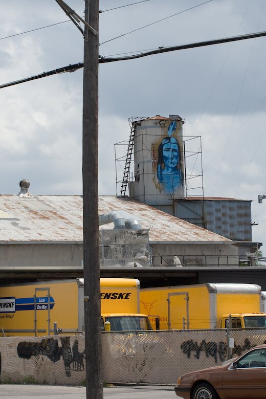
One of my favorite pieces of long-standing illegal graffiti in San Antonio, totally anonymous aside from the image itself, this large painting of a Native American Indian in feather headdress on the Sunshine Laundry building on South Flores has been catching my eye for some time. After asking around, I heard several stories of people who have purportedly met this person, painting the same Indian in other places, (bar bathrooms?) No info as to the artist identity (or given “street” name) has been found. This image is in plain sight of rush hour traffic going by Flores St. on I-35 in San Antonio (near San Pedro exit).
Posted by ben on 27 May 2008 | Tagged as: responses/reviews
Kriston Capps responds to Tyler Green’s post “Heteronormalizing Robert Rauschenberg,” defending his own omission of Rauschenberg’s sexuality in the Dallas Morning News. Be sure to check Green’s response in the comments.
Posted by justin on 26 May 2008 | Tagged as: acquisitions, adventure day, art paparazzi, arts organizations, celebrity sightings, possibilities, sneak peeks
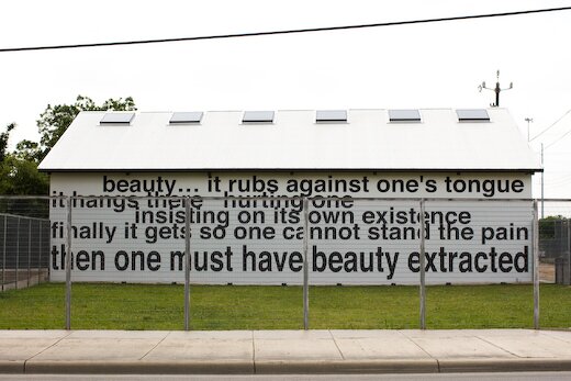
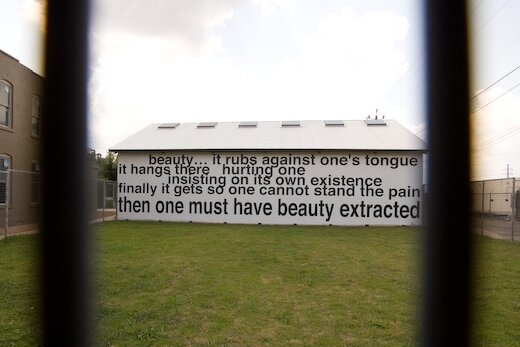
Invites have been circulating recently for a reception to mark the opening of the new Linda Pace Foundation offices (adjacent to Pace’s Camp Street residence) that have been quietly renovated over the last year or so. I noticed on my bike ride to the gallery last week that the big blank wall facing S. Flores had been installed with a new text piece. After some research, I’m concluding it is one of the new pieces of the Pace collection, mentioned in the reception invite as a Daniel Joseph Martinez. The invite mentions two new acquisitions for the Foundation, no info as to the other has yet surfaced.
Posted by ben on 23 May 2008 | Tagged as: design
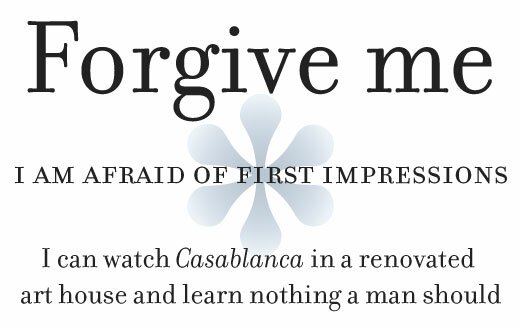
Forgive me for posting what amounts to an advertisement for Emigre’s Bodoni revival typeface, Filosofia. The following is a love letter to Filosofia taken from an Emigre catalog, and I just enjoy reading it too much to resist posting. The image above is set in Filosofia.
Dear Filosofia,
Forgive me. I am afraid of first impressions. I can watch Casablanca in a renovated art house and learn nothing a man should learn. I have seen you escape from your lectures to sip a cappuccino with your back to the café door. You don’t want your business students to notice you leafing through a catalog, and, if they do, you want a quick way out. I understand. You are guardedly ambitious, elegant skirts always past the knee, eyeglasses firmly set on the bridge of your nose: a modern independent woman who demands creative devotion from the apes who grunt for your attention. I have failed to approach you. There is history in you, and I don’t trust myself to respect the silence. I might want too many answers. I blame nerves, bad timing, my life’s tedious projects which are like puppies snapping at my laces. Too many base distractions when I want only to see you. I wish with all my heart to avoid ever being accused of staring too long. So now I am relying on this old-fashioned technology, the letter. To write a letter is now an art, a curiosity, and exuberance, like dusting off an ancient typewriter to prove that the depth of one’s feelings is as vast as time itself. This letter is my awkward gesture. I am at the door, an ape signing a mute language, hoping you will somehow hear, and turn around.
Posted by ben on 21 May 2008 | Tagged as: design, politics
A few days ago Andrew Sullivan reposted an analysis of presidential candidates’ font choices written by and based on a segment that aired on ABC. As discussed in these pieces, Obama uses Gotham, which is a very new font based on an old sign at the New York Port Authority Bus Terminal. Hillary uses Baskerville, designed in 18th century England and popularized in America by Benjamin Franklin. McCain uses Optima, which was created by prolific German type designer Hermann Zapf in the 1950s. But there’s a bit more to this.

First off, as Design Info notes, the typefaces Obama generally uses for his word marks are not Gotham. One word mark uses Perpetua, released in 1929 by Monotype; the other uses, as far as I can tell, a bold version of Requiem, designed by Hoefler & Frere-Jones, the creators of Gotham. (Although Hoefler & Frere-Jones don’t offer a bold version of Requiem, so maybe that’s not it.) Gotham was originally designed for a commission for GQ, which wanted a strong masculine font that felt traditional yet contemporary. Requiem is based on a face found in a Renaissance writing manual, and, according to the creators, “celebrates the fertile world of Renaissance humanism.” Perpetua was designed by Eric Gill, a stone cutter who saw Perpetua as a rational, humanist type for the 20th century. This is a complex mixture of type decisions, but I think it all boils down to a set of progressive, rationalist types that convey strength.

Hillary’s choice, Baskerville, is also a rational, neoclassical face created by British printer John Baskerville, a vocal atheist. Oddly enough, his magnum opus was the “Baskerville Bible,” printed for Cambridge press. Baskerville created only a small edition of this Bible, for which he created the ink and paper, as well as using his own typeface. Hillary’s choice in using this font is, I think twofold. First of all, it has historical roots in revolutionary America, where it was championed by Benjamin Franklin, a friend of Baskerville’s. Second, its use today is somewhat academic (its use was revived by Harvard University Press in 1917), and lends Hillary’s campaign the wonky character that she worked so hard to develop before ditching it for gritty populism sometime between the primaries in Ohio and Pennsylvania.

John McCain’s choice, Optima, was designed by Hermann Zapf, a German designer who modeled it after Roman inscriptions. I actually think the McCain campaign’s choice here was fairly straightforward: Optima is used for the engravings on the Vietnam Memorial. Since McCain’s campaign is largely based around his military experience, this choice makes sense.
Extra Bonus Link: the designers of Obama’s font choices Gotham and Requiem make fun of McCain’s and Clinton’s font choices.
Posted by ben on 19 May 2008 | Tagged as: r.i.p., responses/reviews
I decided not to post on the death of Robert Rauschenberg because I figured everyone else would. (That’s the attitude that has led to me posting only twice in the last three weeks. Sorry about that, folks.) But I would like to draw your attention to Tyler Green’s post on arts writers all over the country eliding Rauschenberg’s homosexuality, despite its centrality to his work.
Posted by michelle on 19 May 2008 | Tagged as: art paparazzi
The Los Angeles County Museum of Art spent the last three years curating a massive show called Phantom Sightings: Art after the Chicano Movement. The catalog is a beautiful, hard cover book that features primarily LA based artists with a couple of San Antonio troublemakers in the mix: Alejandro Diaz and . The show will travel to Mexico City, Berlin, Paris and New York (Rita Gonzalez, is this accurate?). Alejandro should be quite joyful these days, having recently been awarded the Louis Comfort Tiffany Foundation award in the amount of $25,000. That’s a lot of tacos.
Other award winners included former Artpace resident, Wangechi Mutu and Houstinite Robert Pruitt. Congratulations!
[photo credit: courtesy A. Diaz via jameswagner.com]
Posted by michelle on 14 May 2008 | Tagged as: music, performance art
Posted by ben on 10 May 2008 | Tagged as: essays, music
I just ran across a wonderful series of essays on New Music Box covering the history of percussion in American music. Considered in Europe to be a non-essential, accentual part of music, it was largely American musicians who brought percussion out of the shadows in Western music. The author, Nicole V. Gagné, identifies three strains in the development of American percussion: the rise of multiculturalism and “world music”; the increasing reliance on percussion in jazz and other popular music; and the more philosophical “all-sound music of the future,” in which John Cage’s break from harmonization was the watershed moment. Of course these strains are not independent; jazz drummers incorporated African, Cuban, and Indian percussion, just as the “all-sound” musicians had their flirtations with popular music.
Posted by ben on 06 May 2008 | Tagged as: acquisitions, arts organizations
Kriston Capps details a major gift to the Blanton from collectors Dorothy and Herbert Vogel in the Dallas Morning News. The gift will include work by 26 artists, including Elizabeth Murray, Richard Prince Pettibone, Lawrence Weiner, and Richard Tuttle.
Posted by ben on 05 May 2008 | Tagged as: books, design
In connection to Hirsch’s essay on walking and poetry I discussed recently, here’s a snippet from Robert Bringhurst’s The Elements of Typographic Style:
For all the beauty of pure geometry, a perfectly square block of type on a perfectly square page with even margins all around is a form unlikely to encourage reading. Reading, like walking, involves navigation – and the square block of type on a square block of paper is short of basic landmarks and clues. To give the reader a sense of direction, and the page a sense of liveliness and poise, it is necessary to break this inexorable sameness and find a new balance of another kind. Some space must be narrow so that other space may be wide, and some space emptied so that other space may be filled.
The connection between architecture and typography surfaces at a few points in this book, which is a connection worth exploring a bit. I wonder if that is a more apt comparison than Marshall McLuhan’s assertion that “the book is an extension of the eye… clothing, an extension of the skin.” That is, is the typographic environment (and more broadly the media environment) more an extension of the body, or a kind of social space that accommodates the body? More likely, it’s a bit of both; but I think the distinction is worth considering.