responses/reviews
Archived Posts from this Category
Archived Posts from this Category
Posted by ben on 10 Feb 2010 | Tagged as: ceramics, responses/reviews
The best show Blue Star has mounted since Lonely Are the Brave is closing this Saturday, and it’s well worth checking out on your way to Second Saturday down the street on S Flores. Familiar Unknown: Contemporary Ceramics takes advantage of Blue Star’s large main exhibition spaces to highlight four women working at the forefront of clay art. It’s another example of ceramics becoming an increasingly visible medium in the San Antonio contemporary gallery scene, something I hope to cover more soon. Curated by Ovidio Giberga, an accomplished ceramic artist in his own right, and director of UTSA’s ceramics program, the show is full of strong work, installed impeccably.
Anne Drew Potter’s disfigured characters laugh and scowl devilishly in installations that are both spare and overflowing with heavily wrought emotion. Three bulbous women direct their menacing gazes at a frail, limp rabbit doll in “The Judgment of Br’er Rabbit.” A large yellow baby glazed in dense, bright yellow (which I’m told is a reference to Chinese glazes) delights in the misfortune of a large cloth baby who has tumped over. Across the gallery, another pair vaguely mirror these poses: a young, naked girl ecstatic lifts her arms above her as she stands over a young, naked boy fallen back on his elbows, gazing up.
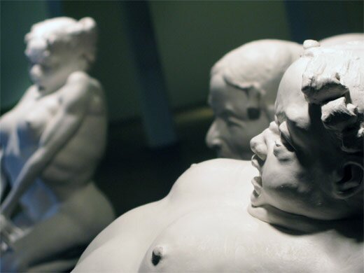
Anne Drew Potter: The Judgment of Br'er Rabbit
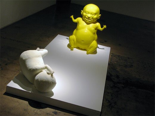
Anne Drew Potter: Big Baby
In the middle of the triangle formed by Potter’s works, an installation by Rebbeca Hutchinson strikes a counterpoint of humble, organic engineering. Apparently built from materials collected on-site, Hutchinson’s spindly sticks with nest-like forms built of paper and clay are scattered sparsely through the space. I feel like I could do a better job describing them if I only knew Japanese, but there’s definitely a healthy dose of wabi in this installation. From the literature, it sounds as if these pieces are destroyed after the exhibit, so I’ll say it again: see this show before it disappears.
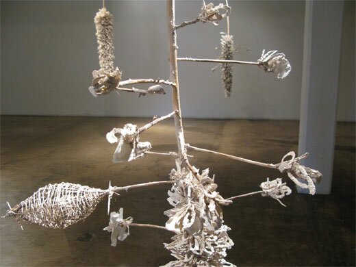
Rebecca Hutchinson Installation
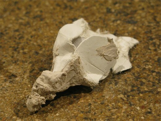
Rebecca Hutchinson Installation
The last installation in the main gallery draws another contrast, with Susan Beiner’s baroque composition of imaginary flowers and and man-made detritus (both exquisitely rendered in porcelain), the only piece that actually hangs on the wall. At first this assemblage appears to consist entirely of flowers and other organic forms, but a close look reveals bolts, pieces of furniture or anonymous industrial objects strewn throughout. Nearby, the flowers growing from the gallery floor make porcelain, foam, and polyfil seem like a most natural combination of materials.
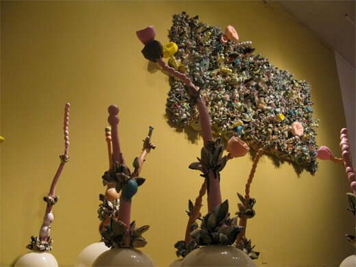
Susan Beiner: Synthetic Stems & Synthetic Reality
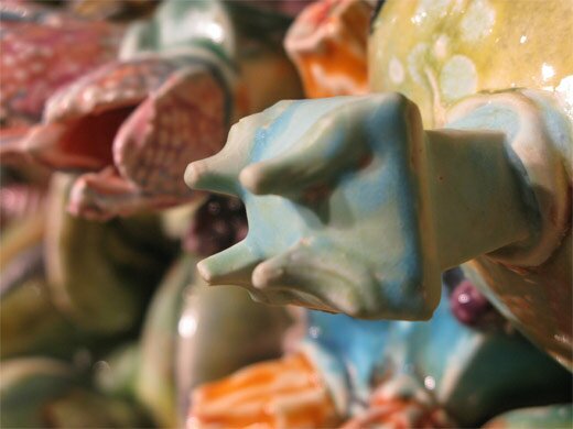
Susan Beiner: Synthetic Stems & Synthetic Reality
Finally, in an adjacent space Blue Star calls the middle gallery, Rebekah Bogard has installed a fantasy world that takes some cues from CGI children’s movies, but sexualizes the characters just a touch. Bright colors and incredibly smooth glazes produce an exhibit that hardly seems ceramic at all. In the artist’s statement, and some other reviews of her work, references to a darkness lurking beneath the candy surface are ubiquitous, but as much as I tried I can’t see it in this installation. It seems very sweet and fluffy to me. Either the artist has moved away from the dark side to some degree, or I’m being naive; judge for yourself.
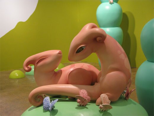
Rebekah Bogard Installation
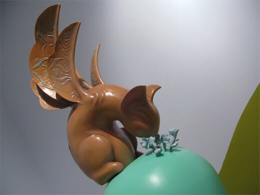
Rebekah Bogard Installation
Posted by ben on 21 Sep 2009 | Tagged as: adventure day, arts organizations, photography, responses/reviews
I just posted my take on the Ansen Seale installation mounted by the Land Heritage Institute over at Glasstire. LHI is positioning itself at the intersection of a number of different issues and movements, potentially functioning simultaneously as a park, an educational resource, an equestrian center, an advocacy group, a think tank and an art center. It should be interesting to watch how the whole thing plays out — the series of events that led it to where it is today has not exactly been predictable, and I doubt its future development will be either. In any case, I’m looking forward to LHI’s “art-sci symposium” The Nature of Place next month. With participants like Sandy Stone, Lucy Lippard, Erik Knutzen from the Center for Land Use Interpretation, and Anjali Gupta from Art Lies, it should be interesting to say the least. We’ll keep you posted.
Posted by hillssnyder on 05 Sep 2009 | Tagged as: adventure day, art paparazzi, music, opportunities, responses/reviews
6:39 am, September 5, 2009.
The In and Outlaws CD release party, Casbeers at The Church, San Antonio, TX.
“…a large vacant area.”
Not at all.
My favorite cow music this side of Jon Wayne.
Brad, the drummer, has a serious demeanor to say the least. Not that different than the visage of Charlie Manson, who appeared on TV a few hours earlier in the bar downstairs where I was hanging out with the chilled out blues of Los Mescaleros and intermittently watching the Cowboys play the Vikings in the last pre-season game of the year. It’s a contest in which a few players who may still have the chance of gaining a roster spot are said to be “on the bubble.” Choice quote, from one of the play by play guys, in reference to Patrick Watkins, who’s putting out an extraordinary performance: “He’s like Glinda The Good Witch. That’s how far inside the bubble he is.” Odie, of the Mescaleros, sitting down behind his stand up bass, has a tambourine strapped head side down to his boot. This makes me smile. I chill a little further in.
Later on, I join the standing room only congregation gathered for The In and Outlaws. The shadow of Lloyd’s bass head on a fluted column, which stands behind him, truncated, too white, supporting nothing. Burton, on pedal steel, wearing an Eleven Hundred Springs gimme cap with a high foam front. Ragged mic hole in Brad’s kick drum. Long red rag hanging from Matthew’s left pocket, has a Fifties Full Service look. Frayed hems of Gordon’s jeans splay around his too flat used car salesman shoes. These are the details that keep me alive between songs.
Downstairs, fetching beers, I hear Mike say, “In Utah they think 88 degrees is hot.” Justin says, “In Berlin they think 87 is.”
Guys, thanks for playing the unicorn number for the encore. Matthew, I love the middle school lead you do on this song. Brad, rumor has it you don’t care too much for playing it, but I like it. You write most of the material — please come up with one titled Guernsey Girl. I know Gordon can sing it.
(photos by Justin Parr)
Posted by ben on 24 Jun 2009 | Tagged as: arts organizations, books, conceptual art, coverage, design, photography, responses/reviews
Dan Goddard, the Express-News’ long-time art critic who was recently canned in a round of layoffs, has just published two good articles dealing with Linda Pace properties. In the San Antonio Current, he discusses the fate of Pace’s storied art collection, and it’s forthcoming permanent home. Designed by British architect David Adjaye specifically for the Pace collection, the project is on hold due to the economic downturn. Apart from that news, which I’ve been hearing unofficially for a while, Goddard reveals many interesting tidbits about the collection, Linda’s personal relationships with various artists, and the ongoing activities of the foundation. I was excited to learn that the Linda Pace Foundation is funding a public work by Jesse Amado to be installed at the downtown library (it will surely be a welcome contrast to their Chihuly).
On Glasstire, Goddard reviews Jonathan Monk’s “Rew-Shay Hood Project Part II” at Artpace. There’s some good context here for understanding the subtleties of the show, from Monk’s history with appropriation to Rucsha’s Catholic background, right down to curator Matthew Drutt’s obsession with vehicle-related art. That Goddard brings up Dave Hickey’s discussion of Ruscha is interesting, given Hickey’s interest in custom cars as an artistic medium. Some people I’ve talked to about the show come away with the impression that Monk is having the Ruscha photos painted on car hoods from the same period; Goddard points out this isn’t the case, the hoods come from one or two decades later than the photos. Perhaps what’s going on here is a contrast between the beginning of the idea of an “artist’s book” (the move away from the artist creating singular, unique objects) and the end of the era of the custom muscle car. As Goddard points out, the push for more efficient, less polluting cars using computer technologies pushed out custom car hobbyist culture to a large extent. But the rise of these computer technologies also empowered artists to move into their own mass production, at the same time allowing the kind of appropriation that Monk himself uses. Although Ruscha wasn’t using computers to produce Twentysix Gas Stations (and I don’t know if Monk used them in his reproductions), they are the descendents of the mass-production technologies that printed Twentysix Gas Stations, and Monk’s relevance certainly has a lot to do with them. Thus in the show we have the suggestion of a kind of ebb and flow, technology and the markets at certain points inspiring very personal expression, at other points depersonalizing art even to the point that it becomes design. And isn’t Monk here acting more like a designer than an artist, if by design we mean depersonalized visual communication?
Posted by ben on 12 Jun 2009 | Tagged as: graffiti, public art, responses/reviews
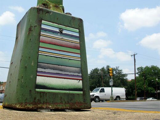
For my latest post on Glasstire, I took on a series by local artist and Emvergeoning contributor Aaron Forland. These pieces help us understand the differences between “street art” and “public art”:
Like a street artist, he uses spray paint on an existing surface, and doesn’t ask permission. But more like a public artist, he takes his time and carefully works over composition and placement (Forland removes these electrical covers, takes them home, methodically paints them, and then replaces them). Some of these pieces are months in the making. He also takes a painterly approach, and the series is much more reminiscent of a series of paintings than a group of tags.
I dealt with similar issues in a review for Art Lies a little while back (in this one I focussed more on street art vs gallery art, which would be an apt way to discuss Forland’s work as well). You can read it here.
Posted by ben on 01 Jun 2009 | Tagged as: architecture, image & sound, music, responses/reviews, sound art
In a post at my new blog on Glasstire, I discuss the relationship between Rudolf de Crignis (currently showing at Lawrence Markey) and La Monte Young, as a way of exploring uses of the term minimalist. This comparison could be extended to some of the other minimalist composers, such as Phill Niblock, who activate architectural space through dense layers of sound at high volume.
But it’s worth noting that while the perceived variation induced by the Dream House’s standing waves calls attention to the physical space, the effect of these relatively small de Crignis paintings is to absorb the viewer in an alternate, purely visual space. It is perhaps the same effect Francis Bacon aims at when : “You would love to be able in a portrait to make a Sahara of the appearance — to make it so like, yet seeming to have the distances of the Sahara.” So while de Crignis’ paintings play with visual perception in a way that is analogous to Young’s or Niblock’s effect on the ear, they are perhaps more disorienting because they absorb the viewer in layers of paint, supplanting for a moment the physical space around them. It is interesting, though, that de Crignis is sometimes compared to James Turrell, an artist who does work with light sources and architecture in a way that is more obviously akin to Marian Zazeela’s light installation in the Dream House.
Posted by ben on 02 May 2009 | Tagged as: arts organizations, photography, possibilities, responses/reviews
Just back from New York, and I must say I agree with Holland Cotter that it’s enlightening to see the Met’s “The Pictures Generation” show alongside the New Museum’s “The Generational: Younger than Jesus.” I also agree with him that the former is a much stronger and more carefully curated group of work than the latter. But at the same time, I don’t think it’s quite right to say that the “generational parallels are so many as to be worrisome. Has new art come no further than this? Is it still tilling fields all but farmed out in the past?”
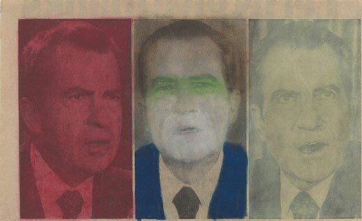
One reason to question this reductive view of current appropriation-driven art is articulated well in an article by Jan Verwoert published a couple of years ago in Art & Research. In it, Verwoert makes a distinction between the appropriation art that was produced in the 1970s and ’80s (see “Untitled (Nixon)” by Paul McMahon above), and another kind of work that emerged in the 1990s. The younger group of artists employ similar strategies as their predecessors, but with different implications. The basic premise is that during the Cold War history had frozen due to a superpower stalemate, and artists such as Robert Longo and Cindy Sherman analyzed culture through the lense of a detachment from history. In the ’90s the movement of history sprang to life again, and the act of appropriation became something more like the act of invocation: “To utter words for the sake of analysis already means to put these words to work. You cannot test a spell. To utter it is to put it into effect.” Artists had to wrestle with the ghosts of the past (a “multiplicity of histories”) as well as the life of the moment, as they dealt with a quickly evolving relationship to history and its connections to the present.
It seems to me that since 2001, this sense of living in a web of histories has only accelerated: from September 11 to Obama, China’s waxing cultural influence to the perpetually imminent collapse of Pakistan, commentators are stumbling over themselves to declare the dawn of new era after new era. It has the urgency of the 1960s, even if the cultural shifts are of a different nature. The ’60s produced a large body of art — both Pop and Conceptual — which resisted metaphor and was later synthesized by the ’70s “pictures generation” artists. But at the same time that this work resisted metaphor, it simultaneously helped open up space for a reinvigoration of metaphor and symbolism, a space that was filled by artists from Kenneth Anger to Martin Luther King (see “” and “I’ve Been to the Mountaintop“). Our moment now is different from the ’60s in many ways, but I think we are seeing a similar opening for a resurgence of the poetic, largely lacking from the artwork of “the pictures generation.”
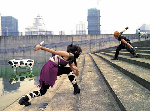
So while I found the pieces at the New Museum generally stale and incoherent (see “Deep Breathing” by Cao Fei above), it’s not because the artists are simply rehashing Barbara Kruger or Jack Goldstein. It’s because the artists in the show generally don’t meet the poetic demands of the moment. They’re caught, unable to take the extra-historical viewpoint of their ’70s counterparts, but unwilling to make the poetic commitments of earlier artists. That’s not to say that other young artists aren’t invoking the past with an incantatory symbolization: it’s just not apparent in the vast majority of the pieces in “Younger than Jesus.”
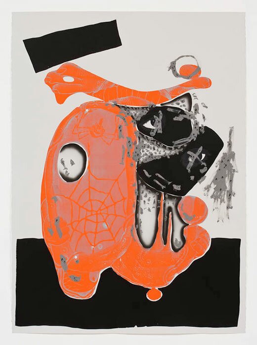
Aaron Curry’s sculptures and prints (see “Cosmic Knot #2″ above) at Michael Werner wove found material and invocation of modernist artworks together in a way that revealed, in the words of Bruce Hainley, “an artist who wishes to make thrilling rather than pernicious the attempt to wrest from the global barrage something inappropriable, irreducible, and questioning, which acknowledges what comes before it, culturally, and from where it arrives without merely desecrating it.” I sense in Hainley’s words (which come from the catalog for the show) a suggestion of the kind of invocation Verwoert proposes. Curry’s show is a thriller, raising the spectre of modernism dwelling somewhere in the water of our reservoirs — not as a chilling memory, but as a living ghost prepared to inhabit our fields, our livestock, our bodies.
UPDATE: This interview with Bruce High Quality Foundation in Art in America seems too pertinent not to add here. From the discussion of Sept 11 as their “creation myth” to the invocation of multiple histories, there are a lot of parallels between this post and the interview. Although I visited the Bruce High Quality studio during my trip, their recent show had just come down, so I missed their new work both in the gallery and in the studio — otherwise they may have made it into the original post.
Posted by ben on 27 Apr 2009 | Tagged as: essays, links, responses/reviews
My review of the current Unit B show has been posted over at Glasstire:
While [Matt] Hanner tells us exactly what he means to convey with his symbol (which he refers to as “the 8th element”), [Stephen] Lapthisophon lets us gather meaning from his free-form visual associations. One potato lies in a nest, conjuring the idea of a particularly large and lumpy egg; others are scattered around as if they were stones gathered by Robert Smithson for one of his non-sites. Hanner’s symbol, rendered in three sculptures using neon, coiled metal wire and burnt incense sticks respectively, asks how materials influence meaning. We are asked on the one hand to synthesize meaning from the repetition of a simple object in various contexts, and on the other to analyze shifting signification as an abstract concept is made material.
Posted by ben on 11 Mar 2009 | Tagged as: adventure day, art paparazzi, arts organizations, graffiti, responses/reviews, sound art
Justin and I made it up to the third Texas Biennial last weekend, and managed to catch everything except Buster Graybill’s giant catfish, which was buried in some kind of enormous boating competition. The big picture take-away is that the Texas Biennial is committing itself to a more unified curatorial vision than in previous years, and to that end brought in writer / curator Michael Duncan from LA to curate the two group and four solo shows. The group shows were, however, not very unified, and I’ve found it difficult to tease overarching themes out of the scattered media, aesthetics, and ideas represented. One theme that did emerge for me is that much of the work expresses a kind of personal mythology, and hews away from overtly political statements. We also saw a lot of the more “traditional” media on display: well-crafted paintings, drawings, and sculptures were everywhere, and few installations or “post-media” sculpture-collages to be found. By my count, there were five videos, one sound sculpture, and one PowerPoint presentation out of hundreds of works. I haven’t quite figured out if this springs from the tastes of Michael Duncan or is supposed to be a reflection of the state of Texas art (although one catalog essay hints at the former: “This is not your average Whitney Program/Cal Arts/Artpace project” says the curator in reference to Lee Baxter Davis’ solo show) [UPDATE: This brief interview with Michael Duncan explains his approach to curating the Texas Biennial].
Here’s the run-down, with photos by Justin Parr:
The group show at the Mexican American Cultural Center (run by Marfa Ballroom alum Simon Orta) was spacious and well-lit, with a lot of paintings, but also a nice sound sculpture by Justin Boyd outside the entrance:
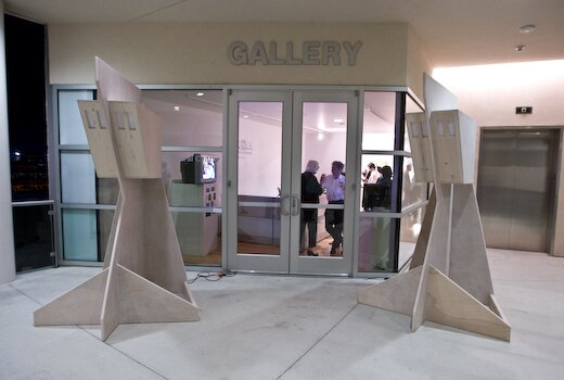
This sound sculpture plays recordings from the nearby river and powerlines to represent the flows of energy around the building — the physical sculpture references the architecture of the MACC itself. We didn’t get any photos from the opening of the group show at Women and Their Work because it was insanely crowded (and, searching on Flickr for “texas biennial 2009″, I get a bunch of photos… from the MACC, so maybe this wasn’t just a problem for us). Check out this slideshow at Women and Their Work’s website for some pics of the art.
The solo shows certainly felt more focused, and for the most part fit together better as a group than the group shows did. I’ll start with Jayne Lawrence, San Antonio artist and co-director of the Cactus Bra gallery, who represented the east (?) south* with a beautiful exhibit at MASS Gallery:
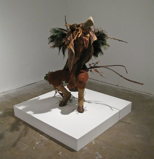
This is a huntress, although if you look closely you’ll see a large phallus between her legs — although Lawrence refers to all these creatures in the feminine, they are transgendered. This show consists of three human-size sculptures and a number of smaller drawings playing with ideas of mutation, a sort of biological collage across genders and species. Hunting and sexuality play big roles in these pieces as well, generating some really striking sex-and-death imagery. Here we have a creature who has been bitten in half by her lover, praying-mantis style:
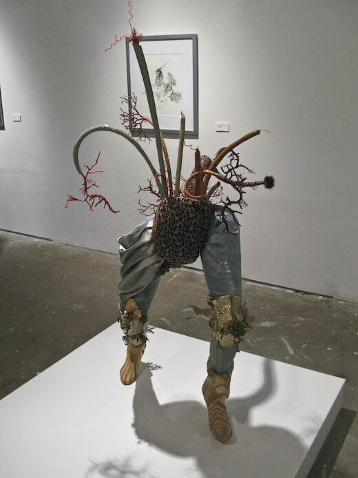
Lawrence combines textile, ceramic, plastic, papier mache, and other media in these highly textural and disorienting creatures. The drawings play with very similar organic themes, although some include architectural elements, hinting at a twisted Maker behind the scenes.
Lee Baxter Davis’ solo show at Pump Project consists of larger watercolors, embodying a mythology as dark as Lawrence’s, although of a somewhat less fantastical and more historicized nature:
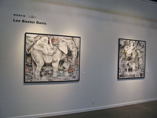
Strange narratives slip through the viewer’s fingers in this dense, magical-realist universe. It isn’t clear to me whether Davis is fictionalizing historical vignettes like Walton Ford, or spinning fresh tales out of a broad cultural experience. In any case, these works carry the tragic weight of a civilazation cutting into the wilderness, and fighting to stake out a stable place in the midst of chaos.
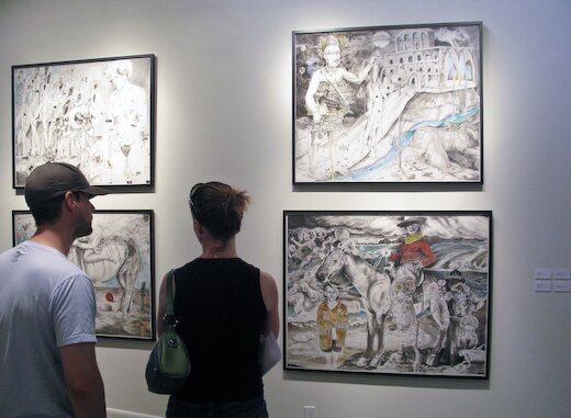
Moving on down to Big Medium, we encounter some large paintings that don’t have as much of the mythological or fantastical feel of Lawrence’s or Davis’ shows, but do play with the sexuality, violence and moral ambiguities contained there:
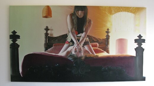
Representing the south east*, Vance’s beautifully rendered paintings from photographs depict psycho-sexual lesbian encounters, which, as Duncan points out in the catalog, are fraught with ambiguity. Themes of violence and humiliation are played against expressions of pleasure in ways that resist moral judgment. Vance is opening up private spaces that feel pure in their honesty, more direct than Lawrence’s fantasies or Davis’ narrative mazes. These scenes are radically intimate, without the weight of history or the complications of the world to get in the way of the pure relation.
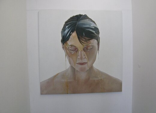
Finally we come to the West Texas show, Will Cannings at Okay Mountain. And here’s where the thematic development falls apart for me:
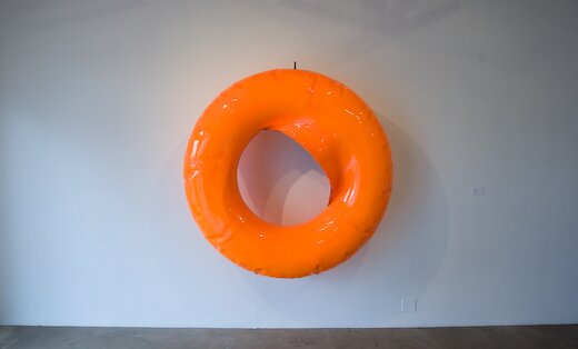
This is a steel sculpture inflated like plastic, or rather, over-inflated in this case, and burst along the inner seam. Personally, I couldn’t help thinking of Jeff Koons’ metal inflatable sculptures, although Michael Duncan was careful not mention those in the literature. It is largely a Pop affair, and it’s difficult to see how this show fits into the larger Biennial. The craftsmanship, though, is very tight, and Cannings put together a strong group that bridges the divide between Pop and Minimalism to some extent (one piece even directly references Brancusi):
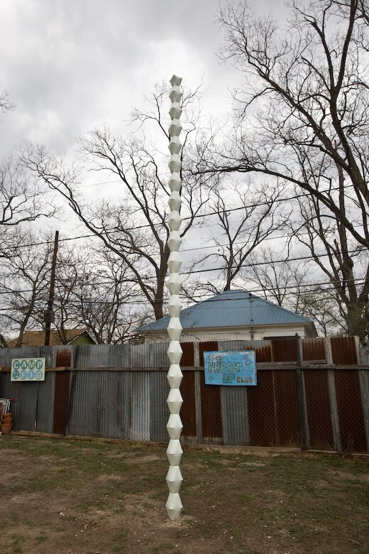
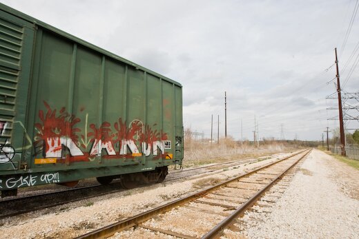
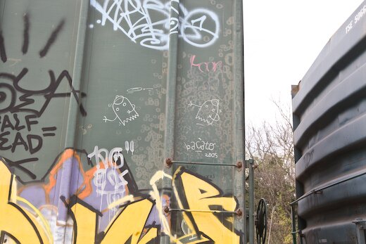
This post is getting pretty long, and I’ve got some other obligations this evening, so I’m going to save the outdoor pieces for another post. But in the meantime, I’ll leave you with some nice graffiti we stumbled on when we took a wrong turn on Shady Lane:
* Corrected thanks to commenter Salvador. That’s what I get for trusting the catalog…
Posted by ben on 10 Mar 2009 | Tagged as: adventure day, coverage, responses/reviews
I’ve spent the last two weekends in Austin for the No Idea Festival and then the Texas Biennial (I hope to have impressions from those up this week, so stay tuned). This weekend San Antonio takes the stage with with some massive events: LACMA’s Phantom Sightings (featuring San Antonio artists Alejandro Diaz and Cruz Ortiz) travels to the Alameda on Friday alongside Caras Vemos, Corazones No Sabemos, the same day SAMA opens a Ry Cooder-commissioned piece by Vincent Valdez and an installation by John Hernandez. Saturday brings the second annual Luminaria arts night, which seems to be more expansive and better-organized than the first.
For background on the well-received Phantom Sightings, see Christopher Knight’s review in the LA Times, and some photos on Flickr.
We’ll do our best to post reactions and reviews in a timely manner, but we’re getting blasted with art from every direction down here in South Texas…
Posted by thomas-cummins on 12 Feb 2009 | Tagged as: politics, responses/reviews, video/film
It’s Oscar time. Just saw the award-winning film “The Reader” and was pleasantly surprised by how good this movie actually is. It’s about inherited guilt of the Holocaust, interpersonal relationships, and as the screenwriter so eloquently put it – “It’s about literature as a powerful means of communication, and at other times as a substitute for communication.” The movie garnered 5 Oscar nominations (including Best Picture) and Kate Winslet is definitely deserving of her front-runner status as Best Actress in her portrayal of an S S guard who seduces a teenage boy.
It’s this portayal, though, that some criticize as being unsympathetic to the Holocaust. The film is immersed in German philosophy and it’s hard for me not to draw references to Hannah Arendt – a German Jew who similarly had an affair with an older Nazi in the form of her teacher Martin Heidegger. In Arendt’s own book on Adolf Eichmann, she coined the term “the banality of evil” when she frighteningly observed how ‘normal’ most Nazis actually were and the need to conform to the social environment, no matter how wrong it might be, is one of the most defining aspects of the human condition. This phenomenon has been shown again and again in subsequent cases like the Stanford prison experiment, the Milgram experiment, the Hofling hospital experiment, the Asch conformity experiments, The Third Wave, Abu Ghraib Prison, as well as in cults everywhere. It’s impossible for a person to step out of their Zeitgeist no matter how hard they try and, indeed, this is the ultimate struggle in the individual (and artist) – between authenticity to him/her own self versus placing him/herself within the social norms of the time.
It’s too easy, though, to sweep Holocaust horrors under the rug by Otherizing historical figures of the past and we need to look at ourselves to find the common denominator in genocide which pervades our history but which still continues to this day. It’s time to stop finger-pointing and go beyond simplistic terms like good and evil. This, however, doesn’t excuse Holocaust deniers in the news today like Bishop Richard Williamson but shows, rather, how very real genocide is. I’m always stunned by how beautiful Hitler’s art actually was and am compelled to refer back to the interesting film ‘Max‘ which poses the question – What would of happened if Hitler’s early career as an artist was accepted by his society?
.
Posted by thomas-cummins on 29 Jan 2009 | Tagged as: responses/reviews, tv
Saatchi is bringing art to Reality T.V. Unfortunately, Texas artists aren’t allowed to submit to this competition as it’s a U.K. thang. I don’t think the artworld has anything to be threatened by this debasing of art to the lowly realms of Reality T. V. After all isn’t this what has been going on since Warhol and Pop Art. I’m not an expert on Project Runway, or the World of Fashion for that matter, but as an outsider it seems that they have done nothing but enhance one another. If it helps one artist get some publicity, connections, and a career then it’s a success in my book. I don’t think Saatchi has anything to worry about either. Regardless if his show fails or not his reputation will always be golden. Any publicity is good publicity and this remains especially true for the artist.
Actually this merger of art with Reality T.V. has already been done once before by Deitch Projects. That particular reality art show was a failure and I, unfortunately, never saw one of its 8 episodes but art has survived that debacle nevertheless. Dave Hickey once noted that good art often happens when highbrow meets lowbrow – so why can’t Reality T.V. similarly be a platform for art. I seriously doubt it will be, but it will still give an interesting glimpse into one of its most richest facets.
Posted by thomas-cummins on 13 Jan 2009 | Tagged as: possibilities, responses/reviews
I took the virtual Prado experience on Google Earth today and, overall, I have to say the hype is a little overblown. I flew into Madrid assuming Google would sweep me straight into the museum but was, instead, confronted by 14 masterpieces outside the Museum. I updated to the latest version of Google Earth and attempted to enter the Museum’s entrance like a video game but was still denied. What you do have access to is each of these paintings at an amazing 14,000 megapixels – which means you can see details never before possible to the general public. Sure, it’s definitely fun to float above craquelure but, in the end, this is only useful for a few specialists in the field of art history. What Google is really giving us is a preemptive glimpse of what is yet to come -that the Prado will eventually be virtualized for the benefit of everyone. This won’t take anything away from the museum experience itself but will, rather, enhance it – just as encyclopedias, tourist’s guide books, and postcards did once before. Don’t get me wrong, Google Earth is still awesome and gets better every month but who really won today were the P.R. firms for both Google and the Prado Museum itself. Just as the ‘Mona Lisa’ became even more famous in the mechanical age of reproduction so did the Museum in the virtual age of the internet. Google says they don’t plan on virtualizing other museums but don’t believe them – they won’t be happy until they document and record every frickin’ aura in the universe.
Posted by thomas-cummins on 08 Jan 2009 | Tagged as: essays, responses/reviews, wordy
Just saw ‘Doubt‘ and it’s definitely worth a trip to the theater but I’m interested in Winkleman’s response to the film and his concern with the word doubt and how artists are suffering from a lack of certainty as well as religion – “Consider this an open thread on vital religious/spiritual impulses, art making, and whether or not any of this is new.”
Indeed, this is not new, and doubt has always been at the root of philosophy. The father of Western philosophy, Socrates, once famously agreed he was the wisest man in Athens because he knew that he knew nothing. Cartesian doubt was named after the father of Modern philosophy, Rene Descartes, and his credo to “doubt everything” (”de omnibus dubitandum est”) in an attempt to find a foothold of certainty on which his philosophy could firmly stand. Descartes noted that, more often than not, things are not the way they appear to be and that our senses often fool us – a stick might seem bent under water or we often awake from dreams that we mistaken for reality and, in the end, we could never truly know if Surrounded by all this uncertainty, however, we can never doubt the fact we are doubting and this naturally led to his bedrock “I think, therefore, I am.” Eventually, Critical Theory would derive its name from Kant’s ‘Critique of Pure Reason‘ (and Judgment) in his criticism of possible knowledge and in a response to David Hume’s radical skepticism.
Winkleman notes “how debilitating uncertainty is” but doubt has proven itself the greatest ally to artists. Marxist theory contends that the primary function of art is social criticism and it is certainly true that art perpetually doubts the ideology of the reigning majority. Indeed, Kierkegaard points out that the word ‘doubt’ is etymologically related to the word ‘double’ – our meaning is always duplicitous – there is always two sides to every story, two sides to every coin, and as Nietzsche would write “there are no facts, only interpretations.” Even the sacred realm of science is not immune from the clutches of doubt and prevailing Theories of Relativity and Quantum Theory actually contradict each other and are probably both wrong. Indeed, our everyday trust in science is a lot closer to a religion than we like to admit. Science is a modern religion of high probability but it can never fully erase doubt. Karl Popper would attack the ultimate futility of science when he harshly pointed out “Science is perhaps the only human activity in which errors are systematically criticized and… in time, corrected” and “all we can do is search for the falsity content of our best theory.” Indeed, Einstein agreed with this final assessment and concluded, himself, that “Only daring speculation can lead us further and not accumulation of facts.” Daring speculation just happens to be the primary realm of the artist. Doubt has certainly been around for a long time, but only in our most enlightened moments.
Texas Public Radio will have a more comprehensive review of “A History of Doubt” at 10am on Sunday. Tune into 89.1 FM to hear the radio show “Speaking of Faith” with poet and historian Jennifer Michael Hecht.
Posted by ben on 05 Jan 2009 | Tagged as: arts organizations, essays, possibilities, responses/reviews, wordy
Edward Winkleman posted a short essay on Saturday, which, in short, claims that the future of the art world is in fact the present of the art world. Citing Barack Obama, Winkleman ties the conventional wisdom about the impact of the internet on contemporary society to the current diaspora of the art world. While the underlying premise is not particularly new or insightful, it was a point that needed to be made: art world observers still looking for “the next big thing” need to take a deep breath and accept that fragmentation is here to stay; and this is, in fact, “the next big thing.” This isn’t a crisis, it’s just a way of being. Winkleman catalogs the effects our database-driven culture is having on the art scene, from curating to collecting to artmaking, and announces that these ripples will only expand as time marches on. What this means is that those looking for a new style or idea to dominate contemporary art culture will be disappointed. Poststructuralism is here to stay, and we’ve only begun to tap its implications.
Fair enough, but I think there’s another point to made here (which is perhaps just a shift in emphasis). Winkleman’s essay focusses on the anachronism, contrasts, and tension bred by a process that revels in referencing the Old Masters alongside contemporary pop culture, in drawing improbable threads through history. He emphasizes the information gathering, the cataloging, the futile but fascinating battle against being overwhelmed by the shear amount of information available to us.
But I think what’s most interesting about our current moment is the ways in which it potentially frees us from these obsessive chases, and actually opens up space for more genuine personal interactions. That might sound counter-intuitive at first, but the fact that there’s no longer a dominating formal or conceptual framework allows us to experience art on more personal terms. As a society, we may no longer reject certain styles of work as “unserious” — we may be forced to accept abstract expressionism alongside minimalism alongside realism alongside surrealism ad nauseum; but as individuals we are more free to just focus on the work that reaches us, rather than struggling to understand paint splatters because Greenberg told us to. And whatever style happens to appeal to you, whether it’s Mark Bradford, Walt Disney, Johathan Ive, Cecil Taylor, Bernard Leach or Outkast, there’ll be plenty of opportunities to make personal connections with others who care about the objects of your quirky taste. We can be more sincere about art if we allow ourselves to be.
So while Winkleman moves toward the conclusion that “art by concensus” will come into vogue, I’m more interested in how much more habitable the long tail is becoming: there are those of us interested in making the connections between styles and disciplines; and there are those whose myopic focus we leach off of to make our broad connections. For both groups, the world is becoming a , if more fragmented.
Posted by ben on 06 Dec 2008 | Tagged as: responses/reviews, video/film
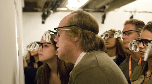
Many of the online discussions and reviews of Synecdoche, New York revolve around the perceived, and self-perceived, intelligence of the viewer. For those who like the movie, the critics who panned it are either too stupid to understand it, or too self-regarding to admit that it affected them. Others attack the admirers for feigning approval only demonstrate their own sophistication. These discussions reveal a lot about the problems with Charlie Kaufman’s latest navel-gazer.
First of all, let’s be clear about this: Synecdoche, New York is not a cinematic game-changer, as some have claimed. It’s fairly original, but is also very much a part of the meta-narrative tradition that stretches from Don Quixote to Inland Empire. “Woody Allen meets David Lynch” encapsulates the movie better than most X meets Y comparisons. Synecdoche doesn’t quite reach the wittiness of Woody Allen’s best work nor the ambitious narrative complexity of late David Lynch; but it’s kind of cool that someone tried to merge the clever, self-absorbed, hypochondriac artist with the non-linear, destabilized, semi-narrative form. What we end up with is a movie that is at turns poignant, funny, cliché and tedious.
Many reviewers agree that after about 45 minutes to an hour, the movie starts drifting and becomes tiresome. People said the same thing about Inland Empire, but Lynch does a better job of maintaining a sense of interpersonal tension, which combines with his consistently powerful cinematography to create enthralling scenes long after the overall narrative has shattered. The result is that as Lynch destabilizes the identities of his characters, they become more intriguing and perhaps more deeply human; as Kaufman does it, they become flatter and more cartoonish. There are some strong scenes late in Synecdoche, New York, but they are harder to come by as the characters are drained of emotional weight.
Charlie Kaufman invested a lot of energy in making this movie clever. Puns and double entendres abound, it’s a surrealism that makes fun of itself, but also takes itself seriously. It’s a fine line that at points Kaufman can’t quite toe, and the characters suffer for it. But the attempt is ambitious enough to make a certain segment of the movie-going public really want to believe that he did pull it off. It’s tempting for these people to assume that Synecdoche’s critics just don’t get it. On the other hand, it’s tempting for those same critics to accuse those who praise it of just being glad to be able to use the word synecdoche in casual conversation, and giggle at the high-minded puns. This cleverness is at once redeeming, as Kaufman is essentially making fun of himself, but also a roadblock to discussion, as people get hung up on the cleverness of the thing and forget to talk about its underlying meaning.
Posted by justin on 11 Nov 2008 | Tagged as: art paparazzi, party photos, performance art, possibilities, responses/reviews, vs.
Heres a short visual account of the opening affair at Artpace last Thursday night. Richie Budd’s pounding geriatric light show mixed with Taryn Simon’s noise-sensitive Cuttlefish made for an interesting experience..
(Lu Chunsheng’s work, also opened that night, is not pictured).
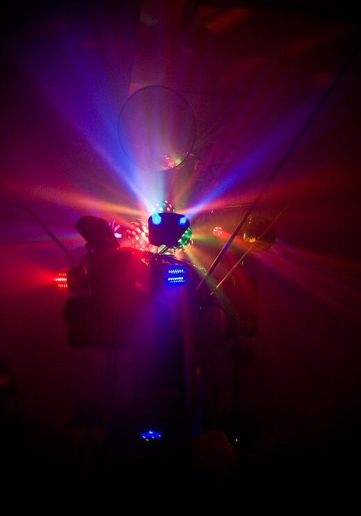
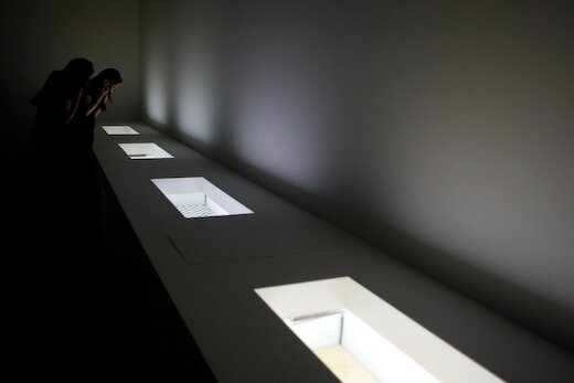
(follow the link for more photos and video of Richie Budd sculpture in action)
Posted by ben on 15 Sep 2008 | Tagged as: architecture, design, graffiti, public art, responses/reviews
Near the end of the Q&A following the Art Guys‘ lecture at UTSA last week, one woman challenged the Houston collaborative’s assertion that their art doesn’t have to mean anything. For this audience member, meaning arises between the object and the viewer, regardless of the intentions of the artist. She must have touched a bit of a nerve; for the first time all night, the Art Guys set aside their jokey, unpretentious demeanor and turned ever-so-slightly preachy. Although the exchange was grating to my ears, it revealed quite clearly an underlying agenda of this 25-years-in-the-making art duo: to short-circuit meaning and expectations in human interaction. At one point, Art Guy Michael Galbreth pointed to a chair and rhetorically asked: What does this mean?
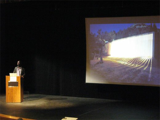
The following night, UTSA (in collaboration with Artpace) hosted a lecture by David Adjaye in which he focussed on his work with public spaces. Early in the lecture he raised the idea of “editing the city.” Throughout the talk this phrase came back to me again and again, as I saw Adjaye weave together cultural artifacts, contemporary urbanist theory, and old-fashioned human proportions into buildings that are at once blank and full of personality. What became clear is that a building can be a segue in an urban environment between two types of space (or even two senses of time), it can tell you something about the city, or about how you should interact. In one case, Adjaye insisted on building a café on the top of a larger London building he was designing, while his clients and others wanted it on the street level. During the lecture he pointed out that having this café above the street would allow people who spend all day on the streets to have a view of the city from above — to see the skyline and the rooftops. But beyond the aesthetics, this placement says something about leisure time, and the way that people ought to share it. Above the street. Away from the hustle.
And so this building says something about the way that people ought to interact, about what they should value. In this same sense, a chair says something about how and where we ought to sit. In the auditorum where the Art Guys spoke, all of our chairs were lined up in a particular way that focussed our attention. If we had walked into a room with 500 pillows on the floor, the space would indeed have had a different meaning. So yeah, Mike, the chair means something.
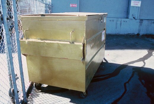
But I don’t intend to play a game of gotcha here. John Cage was perfectly right to say that ““, and the Art Guys do a fine job of short-circuiting meaning in a way that reveals and deepens acts of observing and understanding. An example: During a residency in San Francisco, the Art Guys noticed a dumpster across the street from their apartment. They watched as the community used this resource as a place to discard, and a place to acquire. Something to crouch behind while shooting up heroin, something to throw up in. A canvas for the taggers. It was constantly overflowing with trash, pushed from one end of the parking lot to the other, covered with grafitti. One evening the Art Guys painted the dumpster gold. Shortly thereafter, the property owner cleaned up the area, and started keeping the dumpster under lock and key. The question of why all this happened — why the dumpster was painted gold, why it was treated differently after being painted — is a kind of absurdity that reveals a lot about human interaction. In a sense, it doesn’t mean anything. But it is a catalyst for observation and thought.
Where David Adjaye revealed something about a city by imbuing a building with a different kind of meaning, the Art Guys revealed something about a city through an act of absurdity. In architecture, so often forgotten among its inhabitants, Adjaye pushes us to awareness with an overriding sense of intentionality and purpose; in art, so often overanalyzed by its devotees, the Art Guys push us to awareness with unrelenting whimsy.
Note: The Art Guys have an exhibit called Cloud Cuckoo Land up at UTSA’s 1604 campus through October 12. David Adjaye’s exhibit, Making Public Buildings, is up at Artpace through January 4.
Posted by justin on 15 Sep 2008 | Tagged as: adventure day, art paparazzi, responses/reviews, rock!
(words by Hills Snyder, photos by Justin Parr)

Posted by ben on 13 Aug 2008 | Tagged as: politics, public art, responses/reviews, video/film
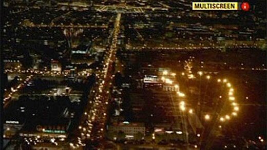
There’s been some grumbling lately about the “fake fireworks” at the Olympics in Beijing. Here’s how the story goes: the people responsible for planning the fireworks developed a display that would outline 29 footprints in fireworks from Tiananmen Square to the Bird’s Nest stadium. Due to the grandiose nature of this display, no single person would be able to see it all — not even from a helicopter. So the special effects team spent a year developing a CGI version of the footprints, made to look as if a helicopter were flying along the route filming it live (including a shaky camera and digitally generated Beijing smog). This video was inserted into the “live” broadcast stream sent to TV networks worldwide, and shown within the stadium itself. No disclaimer was ammended to the video, so audiences thought they were watching “actual” fireworks. When the truth was revealed, many viewers became upset at the deception.
There are so many implications to this I don’t think I can really unpack it all here, but I’ll give it a try. To begin with, we have the notion of authenticity. This July article from the New York Times helps explain the the gap between Chinese and Western relationships with authenticity. (Most of the relevant discussion comes on the last page of the article, e.g.: “it is common practice [to] substitute copies of famous works of art in museums when the originals are unavailable.”) The fireworks actually happened, but to give an impression of the true scope of the display, some cinematic sleight-of-hand was necessary. Here’s a video someone shot of the — not so impressive. The idea here was not to embellish reality, but to give viewers some sense of a reality they couldn’t fully experience. A disclaimer would in some sense rob viewers of the experience as well: perhaps ironically, the closest a viewer could get to experiencing the full display was to watch a CGI version of it thinking it was authentic. But, for a Westerner, that won’t do. If our experience of a thing must be partial in order for it to be real, so be it, even if that “reality” is only through the TV screen. We’d rather watch a video of part of the display, and then read about how it stretched across Beijing, than to see a simulation of the whole thing.
I’m sure it would be possible to go on for a few thousand more words on the ideas of authenticity that this brings to the fore (sprinkling in some appropriate snippets of Baudrillard, of course), but let’s move on. What was the point of this display? In the West, Tiananmen Square is largely associated with the Tiananmen Square Massacre, but its history is a comprised of a long string of political and military conflicts. Symbolically, it can be seen as the seat of political power in China, stretching back to the Ming Dynasty. These footprints, walking from the site of battles, protests, massacres, and Mao Zedong’s proclamation of the People’s Republic of China in 1949, to the site of the Olympics, represent China’s lurching entry into the capitalist global economy.
China is stuck in a precarious position with the West: it constantly signals that it wants to engage as political equal with the US and the EU, but cannot bring itself to uphold even the inconsistently enforced standards of human rights cherished by the West. As noted in the Sky News article linked above, the architect who designed the Bird’s Nest stadium recently wrote on his blog about the Beijing Olympics:
He was directly critical of China’s ruling communist party, characterising the ceremony as “a showcase of the reincarnation of the Marxist imperialism; the ultimate paragon of an all embracing culture of fascist totalitarianism; an encyclopaedia that encompasses total defeat in intellectual spirit.”
Perhaps the Chinese relationship with authenticity is indicative of a deeper disconnect between the Chinese and Western understanding of the world. Even in its symbolization of a movement towards Western values, China has managed to offend.
UPDATE: Oh yeah, and then there’s this.
Posted by ben on 02 Jul 2008 | Tagged as: essays, performance art, politics, renegade performances, responses/reviews
My admittedly slow-on-the-draw take on the Aliza Shvarts controversy was just published in the Current:
Art can be viewed as a sort of safe space in which society allows itself to push moral boundaries with the understanding that the artist is asking a question. Behavior that would otherwise be proscribed is permitted in order to catalyze moral evolution. We can draw analogies here to other safe spaces that humans set up in order to take otherwise unacceptable risks: the boxing ring, the therapist’s office, even the dreamworld, where desires and fears are explored without physical commitment. Therapeutic uses of art are well established, as is the connection between dreams and artistic production.
Problems arise, however, when the boundary between art and life is blurred. When we move from image to enactment, a crucial line has been crossed, and the artistic space becomes not so safe. As much as morally questionable performances have been integrated into the artistic canon, it is possible that they will always provoke trepidation, if not outrage, in the general public.
Further reading:
Posted by ben on 26 Jun 2008 | Tagged as: acquisitions, politics, responses/reviews
 The New York Times is covering a lawsuit that Gerard Malanga (a Warhol assistant and Factory fixture) recently brought against sculptor John Chamberlain. Chamberlain had sold a series of silkscreened canvases bearing his likeness, and made in Warhol’s style, to a collector. A panel charged with authenticating Warhol’s works had declared them genuine. Malanga accuses Chamberlain selling the prints in bad faith, claiming that they were made by Malanga himself, not Warhol. And now he wants his canvases back. Chamberlain apparently made $3.8 million off the deal, and Malanga is pissed, calling him “a consumate fraudster.”
Of course, some people would apply that label to Warhol. And I do have to wonder, if Gerard Malanga was going around making “Warhols” after he left the Factory, how much room he has to malign the motives of Chamberlain. I’m reminded that Jed Perl once called Warhol the “evil prophet of the profit motive” in art. Warhol had no problem, though, with other artists mimicing his work — he would even give his original silkscreens to people like Elaine Sturtevant to make the process easier. It’s one thing for collectors to be obsessed with the origins of these easily reproduced “Factory” prints. But for Malanga, who worked alongside Warhol, to split hairs over the identity of the artist seems just a bit petty. Even if John Chamberlain is a liar.
UPDATE: Maybe the real story here is the Warhol Authentication Board.
Posted by ben on 24 Jun 2008 | Tagged as: acquisitions, arts organizations, responses/reviews
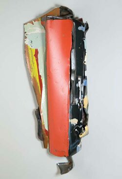 The McNay holds a special place in many of our hearts. I’m not alone in having visited the museum over the years, finding my relationship with certain works growing stronger each time I returned. The lovely dreamlike Redon, the Waterlilies, a little Matisse sculpture — all carefully presented in this old Spanish colonial mansion. Sometimes a piece might pop up that I’d seen a hundred times but never really looked at. So it goes. Almost everyone, in every city, has their little aesthetic oasis. And that little oasis will inevitably change, growing or withering depending on the whims of fate. Now the McNay has a new $50 million wing.
As I thought about the McNay’s new Stieren Center, and what to say about it, I came across Jed Perl’s rumination on museums in the last issue of the New Republic. A lot of it is standard Jed Perl: bitching about the art market, trashing Koons and Hirst and Eliasson, along with some of America’s biggest art institutions. Fair enough — he makes plenty of good points, even if his tirades are a bit predictable at this point. But Perl also develops the notion that the museum ought provide a stable sense of place. And that art itself ought to offer a world to enter into — not just a wry joke or another brand name to buy into.
Perl talks about the reluctance of the New Museum and the Broad Contemporary Art Museum to offer the visitor a sense of ground, of rootedness. For those of us who have lived in San Antonio for a while, or who grew up here, the McNay has always had that sense of place. It is intimate and stable — you can form a relationship with it that endures and grows. So how does the new Stieren Center fit into this concept of the museum as a grounding, intimate public space?
The building itself is nice. It’s nice to have a space at the McNay that was made for looking at art. There’s the high-tech glass ceiling that adjusts to the natural light, and indoor lights set to automatically supplement the sun when necessary. The flow of the galleries works pretty well, and there’s a sense of elegance to the space. Some of my architect friends complain that it’s a Renzo Piano rip-off, and considering how close we are to the Menil, it’s a bit disappointing to have that shadow cast over the space from the very beginning.
But then you see the art. The innaugural exhibit brings out the big guns that have for some reason been collecting dust in the McNay’s attic. Beautiful works by Joseph Cornell, Jean Arp, John Chamberlain, Paul Feeley, John McLaughlin and on and on fill the space (and more contemporary names too — Kiki Smith, Sandy Skogland, Ernesto Pujol). The show’s not so cohesive — the visitor has to move quickly from Op Art to Minimalism to Abstract Expressionism to Conceptualism — but the groupings generally work, and as a collection of modern and contemporary art, I think it’s stronger than the offerings at SAMA or the Blanton in Austin; definitely a major contribution to our city’s culture.
Then it dawns on me: there’s another show coming up in August? Where is all this work going? Back in the attic? And this is where we start to get back into groundedness. In a New Light is honestly a show I could visit many times over, and knowing that it will come down to make way for touring exhibits in a month or two is painful to consider. I take heart in the fact that René Barilleaux has organized some wonderful contemporary shows over the years, and will be able to do so much more with this new space. But at the same time I lament that this part of the collection is not one that I will grow to know as I have the more traditional work in the museum’s collection.
Posted by ben on 16 Jun 2008 | Tagged as: arts organizations, photography, responses/reviews
Tyler Green points to posts by Daniel Drezner and Barry Gewen regarding the fate of the public intellectual in recent years. Drezner argues that, partly thanks to the blogosphere, the pool of public intellectuals is as strong as ever. Gewen thinks Drezner’s playing fast and loose with the term “public intellectual” — and in some cases I’m inclined to agree. I would consider Joshua Micah Marshall and several others on the list to be dedicated political analysts, although I think other names on Drezner’s list do make the cut (Christopher Hitchens and Andrew Sullivan, for instance).
At any rate, Green brings up the question of how many public intellectuals spend much time talking about visual art these days, and I think he’s right that the answer would be “not very many” (although I see no reason Dave Hickey couldn’t slip into Drezner’s list). But his explanation for this fact — that art critics “tend to burrow and bunker into the safe little cocoon of the art world, rarely engaging issues, ideas outside the ghetto” — needs some unpacking. It’s true that the visual art world can be insular in a lot of ways. I think part of the reason for this is that it is one of the few creative communities that has not embraced mass production in a comprehensive way. A work of visual art, unlike a typical book, album, or film is almost always limited in quantity. When it’s not (see Felix Gonalez Torres), it’s usually to make an abstract point about materiality or something. Even artists who use inherently reproducible media (e.g. photography) artificially limit their works to editions, apparently in order to remain within the prescribed economic structure of the art world. This makes the underlying structure of the art world inherently elitist.
But I think there’s another, perhaps more meaningful reason that the visual arts are rarely part of a broader public discourse (after all, every form of intellectualism tends toward elitism). While Green says that visual art “rarely engag[es] issues, ideas outside the ghetto,” visual artists work hard to embrace other disciplines and incorporate them into their toolbox. There has been a steady trend of breaking down these barriers between art forms at least since Duchamp. But, counterintuitively, this very openness has bread insularity. When a visual artist incorporates a technique from the music world, or an idea from the political realm, it is to build it into an esoteric conceptual structure. It’s rare for a contemporary artist to deal with an outside idea on its own terms — it’s more common to appropriate the idea or image and use it to comment on the art-historical tradition. This Talmudic labyrinth usually doesn’t yield much of interest to the broader public discourse.
Now I don’t mean to imply that artists have nothing to contribute to a broader conversation. Far from it. But for a public intellectual to engage with the art community in a meaningful way, they’re going to have to cut through many layers of irrelevant meta-discussion to get to the heart of the artistic statement. At a certain point, they’ll realize that they could more easily broaden their field of useful knowledge by studying economics or film.
Posted by ben on 05 Jun 2008 | Tagged as: arts organizations, responses/reviews, sneak peeks
I like Elaine Wolff’s in-depth review of the new Stieren Center at the McNay. I’ve often felt that René Barilleaux doesn’t get enough credit for the work he does bringing strong contemporary art to the McNay — and I think part of the reason is that he never had the space to really show off his talents as a curator. At the same time, it’s really been a tragedy to have so many of the McNay’s modern and contemporary works in storage for a lack of exhibition space. As nice as the McNay is, I think a lot of people view it as “that cute little museum tucked away in Alamo Heights.” — but I think the collection is really better than that. Hopefully the new expansion will allow it to spread its wings and really give SAMA a run for its money. I’ll give you my impressions after checking in with the new space this weekend.