Buildings and Dumpsters
Posted by ben on 15 Sep 2008 at 04:34 pm | Tagged as: architecture, design, graffiti, public art, responses/reviews
Near the end of the Q&A following the Art Guys‘ lecture at UTSA last week, one woman challenged the Houston collaborative’s assertion that their art doesn’t have to mean anything. For this audience member, meaning arises between the object and the viewer, regardless of the intentions of the artist. She must have touched a bit of a nerve; for the first time all night, the Art Guys set aside their jokey, unpretentious demeanor and turned ever-so-slightly preachy. Although the exchange was grating to my ears, it revealed quite clearly an underlying agenda of this 25-years-in-the-making art duo: to short-circuit meaning and expectations in human interaction. At one point, Art Guy Michael Galbreth pointed to a chair and rhetorically asked: What does this mean?

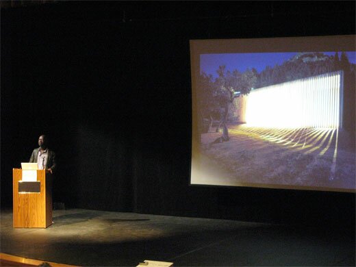
The following night, UTSA (in collaboration with Artpace) hosted a lecture by David Adjaye in which he focussed on his work with public spaces. Early in the lecture he raised the idea of “editing the city.” Throughout the talk this phrase came back to me again and again, as I saw Adjaye weave together cultural artifacts, contemporary urbanist theory, and old-fashioned human proportions into buildings that are at once blank and full of personality. What became clear is that a building can be a segue in an urban environment between two types of space (or even two senses of time), it can tell you something about the city, or about how you should interact. In one case, Adjaye insisted on building a café on the top of a larger London building he was designing, while his clients and others wanted it on the street level. During the lecture he pointed out that having this café above the street would allow people who spend all day on the streets to have a view of the city from above — to see the skyline and the rooftops. But beyond the aesthetics, this placement says something about leisure time, and the way that people ought to share it. Above the street. Away from the hustle.
And so this building says something about the way that people ought to interact, about what they should value. In this same sense, a chair says something about how and where we ought to sit. In the auditorum where the Art Guys spoke, all of our chairs were lined up in a particular way that focussed our attention. If we had walked into a room with 500 pillows on the floor, the space would indeed have had a different meaning. So yeah, Mike, the chair means something.

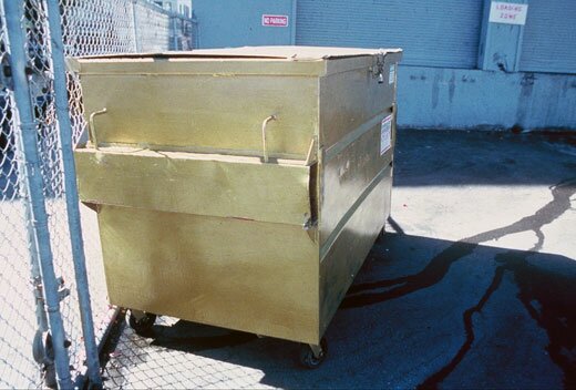
But I don’t intend to play a game of gotcha here. John Cage was perfectly right to say that ““, and the Art Guys do a fine job of short-circuiting meaning in a way that reveals and deepens acts of observing and understanding. An example: During a residency in San Francisco, the Art Guys noticed a dumpster across the street from their apartment. They watched as the community used this resource as a place to discard, and a place to acquire. Something to crouch behind while shooting up heroin, something to throw up in. A canvas for the taggers. It was constantly overflowing with trash, pushed from one end of the parking lot to the other, covered with grafitti. One evening the Art Guys painted the dumpster gold. Shortly thereafter, the property owner cleaned up the area, and started keeping the dumpster under lock and key. The question of why all this happened — why the dumpster was painted gold, why it was treated differently after being painted — is a kind of absurdity that reveals a lot about human interaction. In a sense, it doesn’t mean anything. But it is a catalyst for observation and thought.
Where David Adjaye revealed something about a city by imbuing a building with a different kind of meaning, the Art Guys revealed something about a city through an act of absurdity. In architecture, so often forgotten among its inhabitants, Adjaye pushes us to awareness with an overriding sense of intentionality and purpose; in art, so often overanalyzed by its devotees, the Art Guys push us to awareness with unrelenting whimsy.
Note: The Art Guys have an exhibit called Cloud Cuckoo Land up at UTSA’s 1604 campus through October 12. David Adjaye’s exhibit, Making Public Buildings, is up at Artpace through January 4.
Great post–welcome back, Ben.
Adjaye’s MCA Denver building features a cafe on top of the building as well. I think it’s the only part of the building that didn’t make sense because it did feel a little confining. The building is clearly $16 million worth of conceptual architecture that wouldn’t have been built had Denver not been going through a cultural renaissance, of sorts (Daniel Libeskind’s re-design of the Denver Art Museum has had mixed reactions. It’s hideous, in my Denver native opinion). Lots of money flowing into the local art scene there right now. Editing a city can’t happen without that influx of capital.
wow. ben is really stupid, and wants to fight against artists he is viewing? if you dare argue that you are being critical you need to fucking hang yourself.
ART GUYS ARE OLD FASHIONED!! click here to read my 2¢.
…must mean somethin.
♛
Summer has gone and our weekly events in Marbella & Zante along with tour dates in Ibiza & Kos were all a great success. We are now taking you to brand new venues in the U.K and will once again be having monthly events in Spain.