architecture
Archived Posts from this Category
Archived Posts from this Category
Posted by ben on 13 Feb 2010 | Tagged as: adventure day, architecture, ice
Posted by thomas-cummins on 10 Sep 2009 | Tagged as: architecture, graffiti, video/film
This is kinda old but looking at Justin’s slide show of Berlin graffiti wanted me to check it out again. I found the Berlin murals being made but my favorite is still the one posted below. It is an interesting glimpse into the possible legacy of William Kentridge.
Posted by ben on 21 Jul 2009 | Tagged as: architecture, ceramics, design, public art
Platform 21 is hyping repair as “the new recycling” with its Repair Manifesto, along with various contests and publicity efforts. It’s interesting that some of the “repairs” Platform 21 is publicizing are not functional or structural, but are really aesthetic in nature.
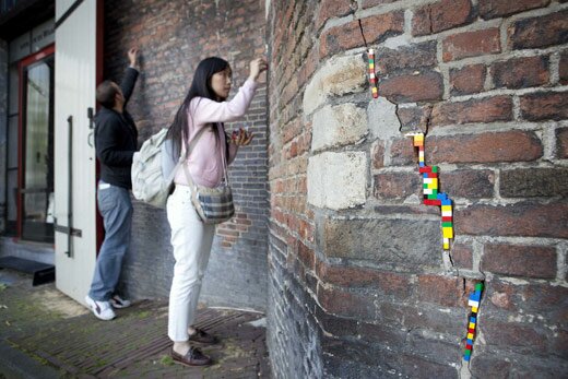
This Jan Vormann project is cool, but it doesn’t appear to offer much in the way of structural integrity. Then again, maybe that’s not the point — highlighting quirky projects like this means more attention for the project, and perhaps a broader reach for the “repair ideology” it is pushing. It also encourages people to think creatively about repair, and makes a chic movement out what often becomes just a greasy time sink. So here’s my contribution: a handmade porcelain teacup I broke and repaired a little while back. It’s not as flashy as Legos in a brick wall, or the “golden seams” of traditional Japanese tea bowl repair, but out of four similar cups, this is now my favorite.
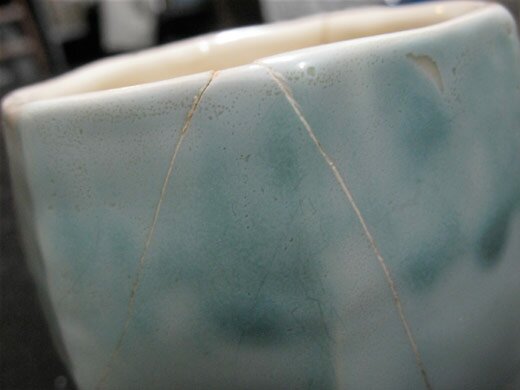
PS. This cup inspired another Emvergeoning post a while back.
Posted by ben on 01 Jun 2009 | Tagged as: architecture, image & sound, music, responses/reviews, sound art
In a post at my new blog on Glasstire, I discuss the relationship between Rudolf de Crignis (currently showing at Lawrence Markey) and La Monte Young, as a way of exploring uses of the term minimalist. This comparison could be extended to some of the other minimalist composers, such as Phill Niblock, who activate architectural space through dense layers of sound at high volume.
But it’s worth noting that while the perceived variation induced by the Dream House’s standing waves calls attention to the physical space, the effect of these relatively small de Crignis paintings is to absorb the viewer in an alternate, purely visual space. It is perhaps the same effect Francis Bacon aims at when : “You would love to be able in a portrait to make a Sahara of the appearance — to make it so like, yet seeming to have the distances of the Sahara.” So while de Crignis’ paintings play with visual perception in a way that is analogous to Young’s or Niblock’s effect on the ear, they are perhaps more disorienting because they absorb the viewer in layers of paint, supplanting for a moment the physical space around them. It is interesting, though, that de Crignis is sometimes compared to James Turrell, an artist who does work with light sources and architecture in a way that is more obviously akin to Marian Zazeela’s light installation in the Dream House.
Posted by ben on 20 Apr 2009 | Tagged as: architecture, arts organizations, celebrations, performance art, public art, r.i.p., video/film
When I was working on my first art review back in 2006, I saw a version of Edgar Arceneaux’s video “Old Man Hill” at the Artpace potluck that launched his residency there. The residency project (which later wound up in the Whitney Biennial) wasn’t as impressive as this simple homage to a man he never met: his father’s father. Arceneaux spelled out the only thing he ever knew about this man — that he was called “Old Man Hill” — in silver balloons, which hovered over the war-torn hills of Sarajevo. One by one the balloons released and twisted toward the sky. The cameras followed the balloons wistfully, clinging to these insubstantial forms seeking oblivion. Occasionally the cameras cut to people going about their lives in the city below, people looking away from these hills with their burned out buildings and piles of rubble.
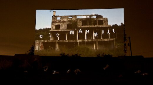
Linda Pace, who had not yet embarked on her battle with cancer, purchased this piece for her collection. Other than that potluck, the video had never been shown publicly; but before she died, Linda asked that it be screened at a special time, with the artist present. The Linda Pace Foundation arranged to screen the final version of this video for Linda’s birthday, last Thursday. Arceneaux was flown in to stage a performance along with the screening. The site selected for the project was the Mission Drive-In, a once-popular drive-in theater now dilapidated, graffiti-strewn, and slated for destruction. (It will be replaced with a new public library).
The evening of the event was overcast, windy, threatening rain. We got there early, and wandered around the old drive-in, its pavement giving way to grass, but its screens still fully intact. One by one, silver balloons were filled up and placed in front of the main screen, spelling out words that were unfamiliar to us, apparently a translation of “Old Man Hill” into Serbian Bosnian.
The translation of words hinted at another translation: the bombed-out hills of Sarajevo where snipers once found cover were translated into a theater in San Antonio, equally desolate, undergoing a wholly other kind of violence. This isn’t to equate the devestation of war to the disappearance of a drive-in, but to translate loss between cultures. Nearby the old theater, the Mission San Jose holds memories of a violence closer to that of Sarajevo: genocide, slavery, subjugation. But to most of us living in San Antonio today, the loss of place is felt more fully than the tragic, large-scale loss of life experienced by those who lived in Sarajevo in the 1990s or San Antonio in the 1700s. The slow erosion of the identities of our cities happens to be the kind of loss we are stuggling with now, the loss that we still don’t quite know how to grapple with.
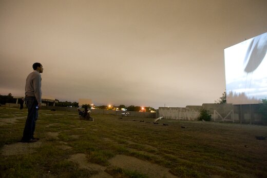
Eventually, as it grew dark, Arceneaux introduced the video, speaking of his search to learn something of his grandfather, a man neither he nor his father ever knew. This was a search to connect his identity to something larger, something more historically rooted. He spoke of his brief relationship with Linda Pace, who worked to create places in San Antonio that connect to what came before them: an old car dealership downtown becomes an artist residency space. This is the act of translating place — it doesn’t make sense to have car dealerships downtown anymore, but these spaces can be translated into something that is meaningful today, that turns loss and emptiness into another kind of value.
The video started, and as we watched Old Man Hill float away into the hills of Sarajevo, we also watched indecipherable words from another place float away into the San Antonio night, sometimes brushing slightly against the aging screen. And even as they disappeared from view, these words became embued with meaning. This was the final screening at the Mission Drive-In.
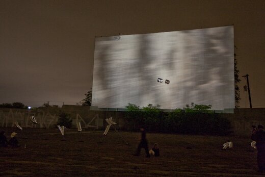
(Photos by Justin Parr, courtesy Linda Pace Foundation)
UPDATE: I’m honored to have Devin King respond to this in the second post on his new blog, Dancing Young Men From High Windows. Hopefully I’ll have time to respond to his post soon, but in the meantime I’ll point yall that way for an interesting reaction.
Posted by ben on 24 Mar 2009 | Tagged as: architecture, design, intellectual property, public art
UPDATE: I just talked to Bill FitzGibbons about an error and some clarifications that need to be made in this post. First off, FitzGibbons is being sued by the City of McAllen. FitzGibbons’ lawyers had drafted a letter to the city to discuss the apparent infringement of his rights, and the city responded by suing in federal court, requesting a ruling affirming their legal right to install this piece.
Apart from that glaring error, FitzGibbons pointed out compositional and conceptual similarities between the pieces. I have only seen two photos of the underpass in McAllen, so I’m just passing on FitzGibbons’ description. Compositionally, the McAllen piece is apparently very similar to Light Channels, in terms of the colors it uses and their sequencing. (In the Current article, McAllen officials are quoted as saying it is different because they did not employ the “chasing” effect that can be seen in Light Channels). Conceptually, Light Channels was designed to connect downtown San Antonio to the near east side, which is cut off by a highway. Highways create psychological barriers, the underpasses mostly being associated with vagrants, but Light Channels turns this into a safe, welcoming passageway. Similarly, , dividing downtown from the mall, the country club, the airport, and, just a little further south, from the border with Mexico. The underpass lighting in McAllen is at the intersection of 83 and S 10th St, a major street that leads the attractions listed above. FitzGibbons’ argument, then, is that conceptually as well as formally, this work mimicks Light Channels. Architectural lighting has been used on underpasses in a number cities; it is the form and purpose of the lighting that this case is dealing with, not the use of lights.
The original post is below:
The Current did some research into Bill FitzGibbons’ lawsuit against the city of McAllen, Texas for apparently ripping off his “Light Channels” piece in downtown San Antonio. From what I can tell, it’s pretty clear that McAllen’s new installation is at the very least extremely derivative of FitzGibbon’s work, and the city officials really ought to be ashamed for so blatantly ripping him off.
But at the same time, I’m not so sure about how successful this lawsuit will be. The lighting system FitzGibbons uses was developed by Philips, and is used for architectural lighting all over the world. If FitzGibbons can sue McAllen for sticking the lights in a highway underpass, whats to stop Fisher Marantz Stone (designers of the lighting on Brooklyn Borough Hall) from suing FitzGibbons himself for a similar use of Color Kinetics on the Alamo? This highlights the differences between designers’ and artists’ attitudes towards intellectual property. While a designer may regard a cheap imitation of her work with contempt, she’s generally not going to sue the offending party unless it’s an exact replica. Artists, I think, tend to feel a stronger sense of ownership over their work and even their concepts.
This may prove to be an interesting legal battle, as it seems it will be fought in something of a legal gray area. Of course, I’m not a copyright lawyer, and the case could be a lot more clear cut than I assume.
Posted by ben on 19 Feb 2009 | Tagged as: architecture, music, public art, sound art
Posting has been light this week because I’ve been helping Jason Kahn set up his sound installation downtown on E Travis St (which is officially opening this Saturday). Kahn, a Zürich-based artist, has been working with sound as a material for years, in both performance and installation contexts. The idea is to activate existing spaces in a way that reveals unnoticed qualities, architecturally, environmentally, and perhaps socially.
In some senses “San Antonio Beauty College” has a strong relationship to Max Neuhaus’ Times Square piece; it is unmarked, and mostly invisible (if you look closely you’ll spot some small speakers); it uses abstract textural sounds that change as you move around them; its significance in the environment is meant to shift as other sounds move along the street. But socially, it feels very different. Times Square could hardly be further from this little piece of Travis street in terms of the amount of foot traffic and the socio-economic makeup of that traffic.
The block of Travis where he is installing this piece (titled “San Antonio Beauty College”) is between Broadway and Alamo. Although it is near the Express-News building, and around the corner from the popular Twin Sisters café, we’ve noticed that no one who has a home seems to walk on this little stretch of Travis Street. The space has become a kind of social eddy, as the employed flow down Pecan or Houston Streets.
As I’ve been publicizing this installation, which is meant to be experienced from the sidewalk in front of the building, I wonder how the existence of the piece will impact the social space it inhabits. Will the people who ordinarily walk down this street notice the subtle sonic textures that Kahn has engineered to be concealed and revealed as the city sounds ebb and flow? Will it attract visitors from nearby businesses, or just the occasional art observer? I’ve often wondered if we’re too limited in the ways that we think about using public art: a monument here, a mural there. Have we overlooked the power of small, almost unnoticeable environmental responses to shift the social landscape? I don’t expect this installation to have much impact in that regard, but if you see me sitting in Twin Sisters watching the sidewalk all day, you’ll know what I’m doing.
By the way, check our event listings to the right for more information on Jason Kahn’s performance this Saturday.
Posted by justin on 26 Nov 2008 | Tagged as: adventure day, architecture, art + bikes, art paparazzi, arts organizations
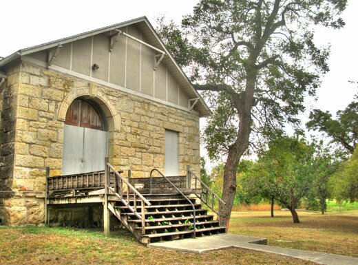
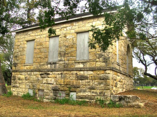
(Words by Gene Elder)
(Photos of Gutzon Borglum studio by Justin Parr)
(The following article is from CATCH-UP, a one issue art magazine that a group of San Antonio artists published in May of 1978.
I chose to write an article about Gutzon Borglum and his abandoned studio on the San Antonio River. It is an interesting history. Artists will find these facts important, as I did.
In 1978 we were protesting the lack of support for the arts. The abandoned studio of Gutzon Borglum where he created the model for Mt. Rushmore symbolized that lack of interest in the arts and the neglect of the creative community.)
IF ITS NOT THE ALAMO, then its just a studio
by Gene Elde_______________r
It has been my philosophy for some time now, that if you want to really enjoy an art exhibit, ignore the artist and the curator and go straight to the janitor. I have found that talking with the soul who picks up the trash after openings and daily sweeps the floors, empties ashtrays, polishes furniture and cleans the restrooms has the more interesting view of the arts. So with this in mind, I sat one Sunday on the steps of the Brackenridge Park Pumphouse and asked for wisdom from the Caretaker of the studio of Gutzon de la Mothe Borglum (The creator of Mount Rushmore.)
INNER VIEW:
There has not been a caretaker here in 10 years… people have forgotten this artistic heritage … but then perhaps that is the responsibility of a good studio, to remember the things that were created here and not to tell everything it knows.
But this studio told me that many times Gutzon sat here in ecstasy; thinking about the monument that would lift the hearts of America long after he had gone … (an artist learns that nothing is ever really his, only his to leave behind.)
Some of the time Gutzon sat here depressed and disenchanted from all the delays … but he understood that too. An artist is a servant as well as a leader and sometimes he must be both alone.
Many thought he was a little crazy … then again… most did not see the world the way Gutzon did.
This fateful studio, a two-story stone building near the Brackenridge golf course, was originally constructed under the supervision of George Washington Brackenridge in the mid-1880s. It served as the second pumphouse for the San Antonio Waterworks Co. until 1915 when it was abandoned. The pumphouse stood at the end of a long power canal which carried water to power turbines connected to a pump with a capacity of three million gallons daily. The water was lifted to the eastern end of Mahncke Park and in 1897 steam power was added to the station.
Gutzon moved to the abandoned pumphouse in 1924, using it as a studio for 13 years.
Now that the hor d’oeuvres have been served, to whet our appetite, shall we share a salad with our famous homemade house dressing?
While reading a book titled Unfinished Dream, by June Zeither and Lincoln Borglum, I enjoyed learning these things and have chronologically and alphabetically tossed them into the salad section.
Research revealed this famous South Dakota mountain site is named after a young New York attorney named Rushmore who was doing legal work for a mining company. When he asked the name of the peak, his companions answered lightly, “Hanged if we know! Lets call the damned thing Rushmore.”
Gutzon’s first model, completed in his winter studio in Brackenridge Park, was of three figures.
Washington: Since he represented the birth of the nation and the noble spirit which started a courageous people on an untried course.
Jefferson: To show the inspiration of the Declaration of Independence along with the foresight of the Louisiana purchase which expanded our country.
Lincoln: Representing the humanity, the suffering, the compassion, and the eternal unity of the nation.
When Roosevelt was chosen it brought forth a flood of controversy. Calvin Coolidge agreed with Gutzon that Roosevelt would properly round out this saga in stone. His enthusiasm for the American West, his efforts in behalf of labor along with the building of the Panama Canal, proclaimed Roosevelt to be the logical choice. To Gutzon this choice was right. “Regardless of what biased people may think of these four human beings, they were the ones who personified certain basic elements, crucial to our survival and growth as a nation.”
Not only was the choice of Roosevelt an issue, Gutzon’s angels commissioned by the Belmont Chapel of the Cathedral of St. John the Divine in New York City erupted into a nationwide controversy. The ecclesiastical hierarchy rejected the models on the grounds they appeared too feminine. “Angels,” they declared, “are masculine.”
Gutzon’s statue of Atlas bearing the weight of the world shocked the conservative. Delighting in this controversy, because “Atlas” turned out to be a woman, the sculptor explained that only woman has the strength and endurance for such a weight.
There was also a conflict with the Daughters of the Confederacy over Stone Mountain which ended with Gutzon destroying his clay models. They raised a furious cry and demanded the immediate arrest of the fleeing sculptor. Gutzon escaped into North Carolina with the law of Georgia hot on his heels. North Carolina’s Governor McLean announced he would call out the militia to protect the sculptor.
Besides being a sculptor, Gutzon served as a chairman of Central Park in New York and gave his thoughts to help San Antonio keep its historic Missions and meandering river. He also worked out an ambitious plan to beautify the entire state of Texas.
He gave a strong speech before the first National Arts Committee urging the government to promote a cultural consciousness in America. He felt that the government should scout out potential artist, but should never try to guide or mold the arts.
Gutzon’s plan for world peace was one of 20 selected for the Edward Bok American Peace Award for writers.
He regularly wrote “Letters to the Editor” delighting readers from coast to coast. They were well written, to the point, attention getting, and presented the unknown side of controversial issues.
Lincoln Borglum described his father as “a man of medium height, stocky build, and exceptionally broad shoulders. He had brown hair and piercing blue eyes. His cheeks were broad, his jaw square, and his chin determined. He was seldom seen without a brisk felt hat, which covered his balding head. His clothing was somewhat of a hybrid between that of an imaginative artist and a western bank president.”
Thrift, strict budgets, or bookkeeping were not necessary parts of Gutzon’s life. “Many times his commissions barely paid for the cost of his supplies, and often he would donate an important work, or turn part of his money back to the organization that commissioned him.”
Mount Rushmore took 16 years of his life. He died in debt, and his son, Lincoln, had to beg the government to pay Mary, Gutzon’s wife, the rest of the fees due Gutzon at his death.
Does
This
Ring
A
Bell
as we engage on an entree where it is
considered in bad taste to request
catsup ?
In 1937, Gutzon left his studio to the Witte Museum, where it was used for the Museum School of Art. This group eventually merged with the Art Institute, started by Marion Koogler McNay. Rumor revealed Etienne Ret, a French portrait painter invited here by Mrs. McNay to teach, worked in Gutzon’s studio. With these events a tradition was born. The tradition of handing down a studio. There were others who worked here before it closed in 1960; Max Fitzpatrick, Chester Tony, Jack Fletcher, and Dan Withers. Since then, various attempts have been made to utilize the building. Julie Black proposed a pottery studio in 1976, but the most recent renovation plan was prepared by Rudy Trevino. Today, after 18 years, we are slowly beginning to gather together at it’s cemented windows and locked door to re-call it’s role as contained in the words of Etienne Ret: “Perhaps I will not come back to teach, but I will come back, yes. San Antonio is after all one of the few cities where you can live life as it should be lived.”
Now there is a pleasant golf course with golfers walking and talking with the crew that maintains the lawns … joggers pass occasionally … people visit, even if only to ask questions about the pumphouse. But the community needs this place to be filled with artists again. It should be used as a meeting house by all the artists in San Antonio. Gutzon would like that.
Time has again brought us here to unlock The Studio doors. Not only the future, but now we know, the choice is to hear the knock or to ignore.
A Fortune Cookie,
begins our next course.
_____________________
CON SAFOS
_____________________
Posted by ben on 15 Sep 2008 | Tagged as: architecture, design, graffiti, public art, responses/reviews
Near the end of the Q&A following the Art Guys‘ lecture at UTSA last week, one woman challenged the Houston collaborative’s assertion that their art doesn’t have to mean anything. For this audience member, meaning arises between the object and the viewer, regardless of the intentions of the artist. She must have touched a bit of a nerve; for the first time all night, the Art Guys set aside their jokey, unpretentious demeanor and turned ever-so-slightly preachy. Although the exchange was grating to my ears, it revealed quite clearly an underlying agenda of this 25-years-in-the-making art duo: to short-circuit meaning and expectations in human interaction. At one point, Art Guy Michael Galbreth pointed to a chair and rhetorically asked: What does this mean?
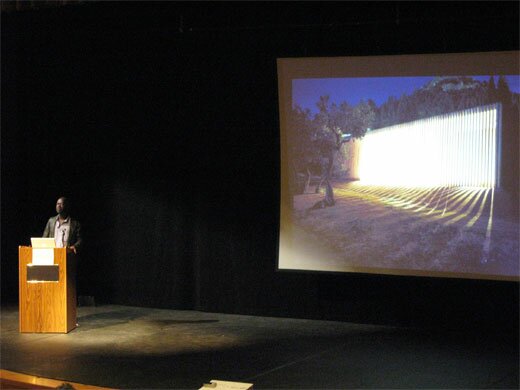
The following night, UTSA (in collaboration with Artpace) hosted a lecture by David Adjaye in which he focussed on his work with public spaces. Early in the lecture he raised the idea of “editing the city.” Throughout the talk this phrase came back to me again and again, as I saw Adjaye weave together cultural artifacts, contemporary urbanist theory, and old-fashioned human proportions into buildings that are at once blank and full of personality. What became clear is that a building can be a segue in an urban environment between two types of space (or even two senses of time), it can tell you something about the city, or about how you should interact. In one case, Adjaye insisted on building a café on the top of a larger London building he was designing, while his clients and others wanted it on the street level. During the lecture he pointed out that having this café above the street would allow people who spend all day on the streets to have a view of the city from above — to see the skyline and the rooftops. But beyond the aesthetics, this placement says something about leisure time, and the way that people ought to share it. Above the street. Away from the hustle.
And so this building says something about the way that people ought to interact, about what they should value. In this same sense, a chair says something about how and where we ought to sit. In the auditorum where the Art Guys spoke, all of our chairs were lined up in a particular way that focussed our attention. If we had walked into a room with 500 pillows on the floor, the space would indeed have had a different meaning. So yeah, Mike, the chair means something.

But I don’t intend to play a game of gotcha here. John Cage was perfectly right to say that ““, and the Art Guys do a fine job of short-circuiting meaning in a way that reveals and deepens acts of observing and understanding. An example: During a residency in San Francisco, the Art Guys noticed a dumpster across the street from their apartment. They watched as the community used this resource as a place to discard, and a place to acquire. Something to crouch behind while shooting up heroin, something to throw up in. A canvas for the taggers. It was constantly overflowing with trash, pushed from one end of the parking lot to the other, covered with grafitti. One evening the Art Guys painted the dumpster gold. Shortly thereafter, the property owner cleaned up the area, and started keeping the dumpster under lock and key. The question of why all this happened — why the dumpster was painted gold, why it was treated differently after being painted — is a kind of absurdity that reveals a lot about human interaction. In a sense, it doesn’t mean anything. But it is a catalyst for observation and thought.
Where David Adjaye revealed something about a city by imbuing a building with a different kind of meaning, the Art Guys revealed something about a city through an act of absurdity. In architecture, so often forgotten among its inhabitants, Adjaye pushes us to awareness with an overriding sense of intentionality and purpose; in art, so often overanalyzed by its devotees, the Art Guys push us to awareness with unrelenting whimsy.
Note: The Art Guys have an exhibit called Cloud Cuckoo Land up at UTSA’s 1604 campus through October 12. David Adjaye’s exhibit, Making Public Buildings, is up at Artpace through January 4.