graffiti
Archived Posts from this Category
Archived Posts from this Category
Posted by ben on 22 Oct 2009 | Tagged as: art + bikes, arts organizations, celebrations, conceptual art, free food, graffiti, public art
This is a little reminder of some of the art events on this busy weekend.
Don’t miss any of this stuff! Seriously!
Posted by thomas-cummins on 10 Sep 2009 | Tagged as: architecture, graffiti, video/film
This is kinda old but looking at Justin’s slide show of Berlin graffiti wanted me to check it out again. I found the Berlin murals being made but my favorite is still the one posted below. It is an interesting glimpse into the possible legacy of William Kentridge.
Posted by ben on 26 Jun 2009 | Tagged as: graffiti, public art
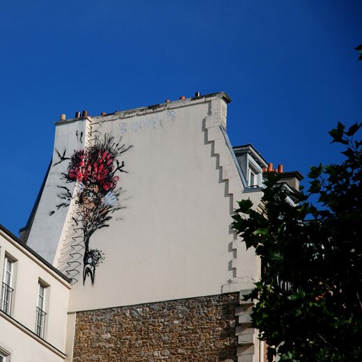
I’m sure I’m late to the party on this one, but a friend just turned me onto French Belgian street artist Bonom (a play on bon homme?), who has worked in Paris and Brussels. Lots of good photos here.
Posted by ben on 16 Jun 2009 | Tagged as: graffiti, politics
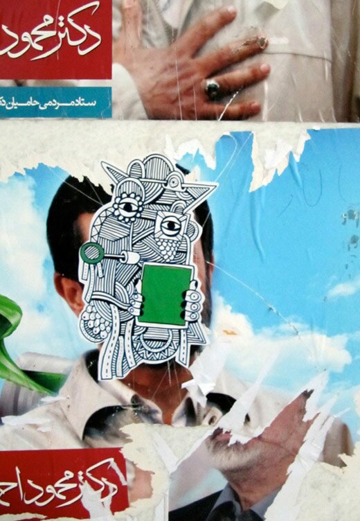
FryingPanFire posts images of street art from Tehran, made by pro-Mousavi activists (h/t Andrew Sullivan). This creature holds a green sign, like many of the protesters:
Posted by ben on 12 Jun 2009 | Tagged as: graffiti, public art, responses/reviews
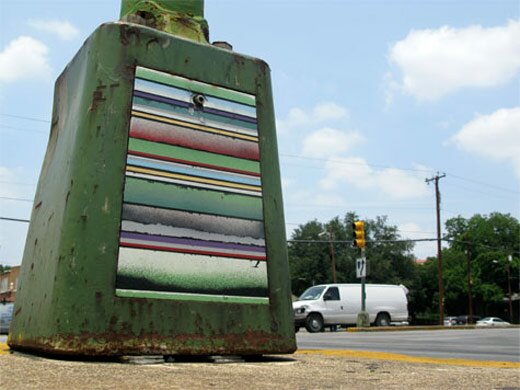
For my latest post on Glasstire, I took on a series by local artist and Emvergeoning contributor Aaron Forland. These pieces help us understand the differences between “street art” and “public art”:
Like a street artist, he uses spray paint on an existing surface, and doesn’t ask permission. But more like a public artist, he takes his time and carefully works over composition and placement (Forland removes these electrical covers, takes them home, methodically paints them, and then replaces them). Some of these pieces are months in the making. He also takes a painterly approach, and the series is much more reminiscent of a series of paintings than a group of tags.
I dealt with similar issues in a review for Art Lies a little while back (in this one I focussed more on street art vs gallery art, which would be an apt way to discuss Forland’s work as well). You can read it here.
Posted by ben on 11 Mar 2009 | Tagged as: adventure day, art paparazzi, arts organizations, graffiti, responses/reviews, sound art
Justin and I made it up to the third Texas Biennial last weekend, and managed to catch everything except Buster Graybill’s giant catfish, which was buried in some kind of enormous boating competition. The big picture take-away is that the Texas Biennial is committing itself to a more unified curatorial vision than in previous years, and to that end brought in writer / curator Michael Duncan from LA to curate the two group and four solo shows. The group shows were, however, not very unified, and I’ve found it difficult to tease overarching themes out of the scattered media, aesthetics, and ideas represented. One theme that did emerge for me is that much of the work expresses a kind of personal mythology, and hews away from overtly political statements. We also saw a lot of the more “traditional” media on display: well-crafted paintings, drawings, and sculptures were everywhere, and few installations or “post-media” sculpture-collages to be found. By my count, there were five videos, one sound sculpture, and one PowerPoint presentation out of hundreds of works. I haven’t quite figured out if this springs from the tastes of Michael Duncan or is supposed to be a reflection of the state of Texas art (although one catalog essay hints at the former: “This is not your average Whitney Program/Cal Arts/Artpace project” says the curator in reference to Lee Baxter Davis’ solo show) [UPDATE: This brief interview with Michael Duncan explains his approach to curating the Texas Biennial].
Here’s the run-down, with photos by Justin Parr:
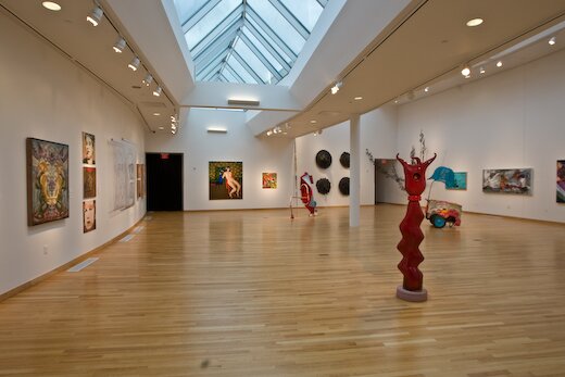
The group show at the Mexican American Cultural Center (run by Marfa Ballroom alum Simon Orta) was spacious and well-lit, with a lot of paintings, but also a nice sound sculpture by Justin Boyd outside the entrance:
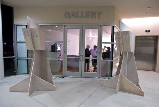
This sound sculpture plays recordings from the nearby river and powerlines to represent the flows of energy around the building — the physical sculpture references the architecture of the MACC itself. We didn’t get any photos from the opening of the group show at Women and Their Work because it was insanely crowded (and, searching on Flickr for “texas biennial 2009″, I get a bunch of photos… from the MACC, so maybe this wasn’t just a problem for us). Check out this slideshow at Women and Their Work’s website for some pics of the art.
The solo shows certainly felt more focused, and for the most part fit together better as a group than the group shows did. I’ll start with Jayne Lawrence, San Antonio artist and co-director of the Cactus Bra gallery, who represented the east (?) south* with a beautiful exhibit at MASS Gallery:
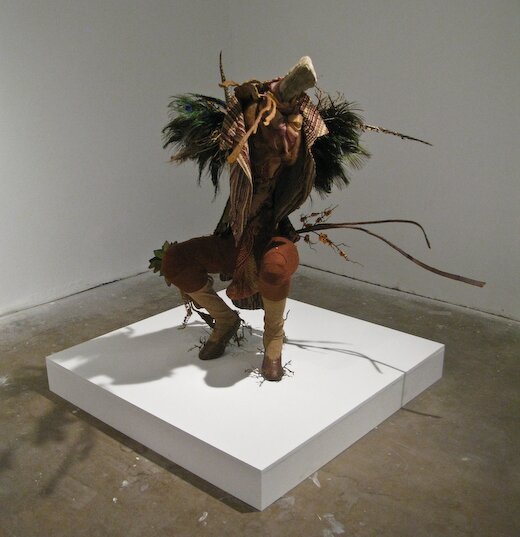
This is a huntress, although if you look closely you’ll see a large phallus between her legs — although Lawrence refers to all these creatures in the feminine, they are transgendered. This show consists of three human-size sculptures and a number of smaller drawings playing with ideas of mutation, a sort of biological collage across genders and species. Hunting and sexuality play big roles in these pieces as well, generating some really striking sex-and-death imagery. Here we have a creature who has been bitten in half by her lover, praying-mantis style:
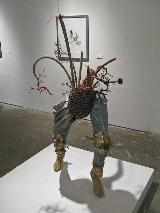
Lawrence combines textile, ceramic, plastic, papier mache, and other media in these highly textural and disorienting creatures. The drawings play with very similar organic themes, although some include architectural elements, hinting at a twisted Maker behind the scenes.
Lee Baxter Davis’ solo show at Pump Project consists of larger watercolors, embodying a mythology as dark as Lawrence’s, although of a somewhat less fantastical and more historicized nature:
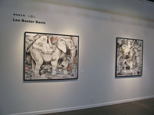
Strange narratives slip through the viewer’s fingers in this dense, magical-realist universe. It isn’t clear to me whether Davis is fictionalizing historical vignettes like Walton Ford, or spinning fresh tales out of a broad cultural experience. In any case, these works carry the tragic weight of a civilazation cutting into the wilderness, and fighting to stake out a stable place in the midst of chaos.
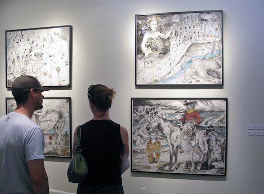
Moving on down to Big Medium, we encounter some large paintings that don’t have as much of the mythological or fantastical feel of Lawrence’s or Davis’ shows, but do play with the sexuality, violence and moral ambiguities contained there:

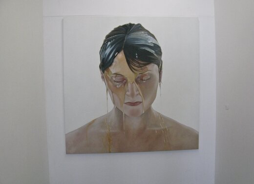
Representing the south east*, Vance’s beautifully rendered paintings from photographs depict psycho-sexual lesbian encounters, which, as Duncan points out in the catalog, are fraught with ambiguity. Themes of violence and humiliation are played against expressions of pleasure in ways that resist moral judgment. Vance is opening up private spaces that feel pure in their honesty, more direct than Lawrence’s fantasies or Davis’ narrative mazes. These scenes are radically intimate, without the weight of history or the complications of the world to get in the way of the pure relation.
Finally we come to the West Texas show, Will Cannings at Okay Mountain. And here’s where the thematic development falls apart for me:
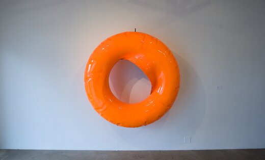
This is a steel sculpture inflated like plastic, or rather, over-inflated in this case, and burst along the inner seam. Personally, I couldn’t help thinking of Jeff Koons’ metal inflatable sculptures, although Michael Duncan was careful not mention those in the literature. It is largely a Pop affair, and it’s difficult to see how this show fits into the larger Biennial. The craftsmanship, though, is very tight, and Cannings put together a strong group that bridges the divide between Pop and Minimalism to some extent (one piece even directly references Brancusi):
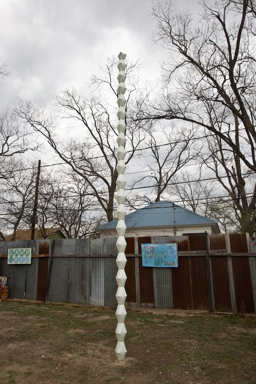
This post is getting pretty long, and I’ve got some other obligations this evening, so I’m going to save the outdoor pieces for another post. But in the meantime, I’ll leave you with some nice graffiti we stumbled on when we took a wrong turn on Shady Lane:
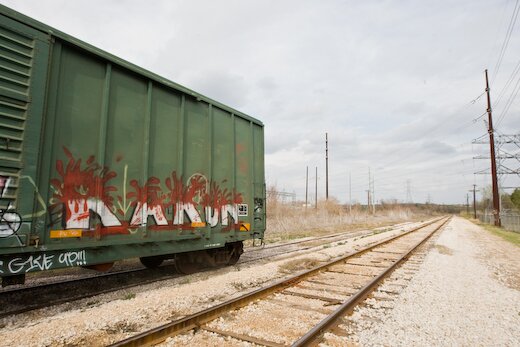
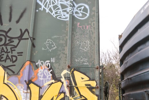
* Corrected thanks to commenter Salvador. That’s what I get for trusting the catalog…
Posted by ben on 02 Feb 2009 | Tagged as: art paparazzi, graffiti, intellectual property, public art
Barry Hoggard posted a photo of a modified Aakash Nihalani piece in Williamsburg to his Flickr account yesterday:
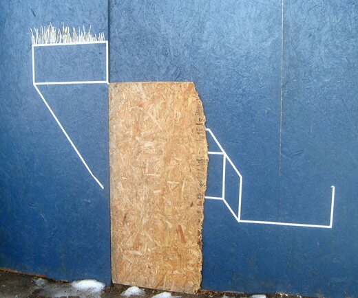
When I saw this, I realized that street art is the original Creative Commons. Put something in a public space and it just begs for “collaboration,” resisting any claim to copyright. (Yes, I know that Creative Commons is not intended to do away with copyright but to make it more flexible, and that street art is more like a perpetual public domain).
Posted by ben on 30 Jan 2009 | Tagged as: graffiti, in yo face, public art
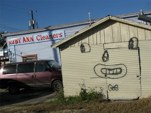
I thought I’d throw a little Friday-night fun your way: another Matthew Rodriguez piece spotted down the street from Emvergeoning headquarters. I think it goes quite well with the hand-painted signage on the Ruby Ann Cleaners.
Posted by thomas-cummins on 29 Jan 2009 | Tagged as: graffiti, links
Never knew this. Always thought Duchamp was using the word Mutt to go against the purity of Modernism.
signature “R. Mutt” – It is not clear whether Duchamp had in mind the German “Armut” (meaning “poverty”). Later in his life Duchamp himself commented on the name of the alter ego he created for this work: ‘Mutt’ comes from Mott Works, the name of a large sanitary equipment manufacturer. But Mott was too close so I altered it to Mutt, after the daily cartoon strip Mutt and Jeff. But not even that much, just R. MUTT.” If we separate the capital and lowercase letters we get “R.M” and “utt”, “R.M” would stand for “Readymade” which is the fountain itself and “utt” when read out loud sounds like “eut été” in French (much like Duchamp’s L.H.O.O.Q.). Together it means “Readymade once was, 1917″. Word games like this are common in Marcel Duchamp’s work.
Posted by thomas-cummins on 12 Jan 2009 | Tagged as: art paparazzi, graffiti
Posted by justin on 11 Jan 2009 | Tagged as: acquisitions, adventure day, art paparazzi, graffiti
Posted by ben on 15 Sep 2008 | Tagged as: architecture, design, graffiti, public art, responses/reviews
Near the end of the Q&A following the Art Guys‘ lecture at UTSA last week, one woman challenged the Houston collaborative’s assertion that their art doesn’t have to mean anything. For this audience member, meaning arises between the object and the viewer, regardless of the intentions of the artist. She must have touched a bit of a nerve; for the first time all night, the Art Guys set aside their jokey, unpretentious demeanor and turned ever-so-slightly preachy. Although the exchange was grating to my ears, it revealed quite clearly an underlying agenda of this 25-years-in-the-making art duo: to short-circuit meaning and expectations in human interaction. At one point, Art Guy Michael Galbreth pointed to a chair and rhetorically asked: What does this mean?
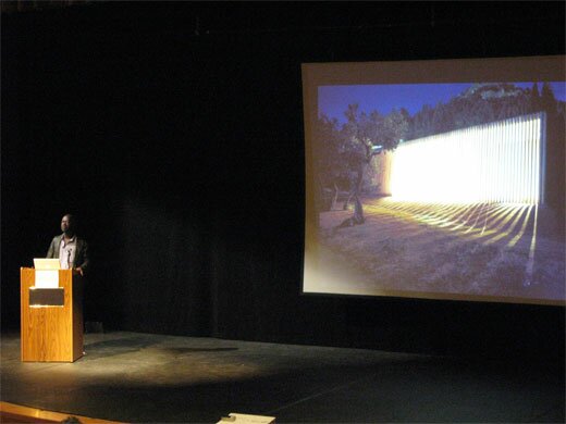
The following night, UTSA (in collaboration with Artpace) hosted a lecture by David Adjaye in which he focussed on his work with public spaces. Early in the lecture he raised the idea of “editing the city.” Throughout the talk this phrase came back to me again and again, as I saw Adjaye weave together cultural artifacts, contemporary urbanist theory, and old-fashioned human proportions into buildings that are at once blank and full of personality. What became clear is that a building can be a segue in an urban environment between two types of space (or even two senses of time), it can tell you something about the city, or about how you should interact. In one case, Adjaye insisted on building a café on the top of a larger London building he was designing, while his clients and others wanted it on the street level. During the lecture he pointed out that having this café above the street would allow people who spend all day on the streets to have a view of the city from above — to see the skyline and the rooftops. But beyond the aesthetics, this placement says something about leisure time, and the way that people ought to share it. Above the street. Away from the hustle.
And so this building says something about the way that people ought to interact, about what they should value. In this same sense, a chair says something about how and where we ought to sit. In the auditorum where the Art Guys spoke, all of our chairs were lined up in a particular way that focussed our attention. If we had walked into a room with 500 pillows on the floor, the space would indeed have had a different meaning. So yeah, Mike, the chair means something.
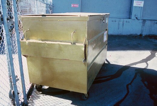
But I don’t intend to play a game of gotcha here. John Cage was perfectly right to say that ““, and the Art Guys do a fine job of short-circuiting meaning in a way that reveals and deepens acts of observing and understanding. An example: During a residency in San Francisco, the Art Guys noticed a dumpster across the street from their apartment. They watched as the community used this resource as a place to discard, and a place to acquire. Something to crouch behind while shooting up heroin, something to throw up in. A canvas for the taggers. It was constantly overflowing with trash, pushed from one end of the parking lot to the other, covered with grafitti. One evening the Art Guys painted the dumpster gold. Shortly thereafter, the property owner cleaned up the area, and started keeping the dumpster under lock and key. The question of why all this happened — why the dumpster was painted gold, why it was treated differently after being painted — is a kind of absurdity that reveals a lot about human interaction. In a sense, it doesn’t mean anything. But it is a catalyst for observation and thought.
Where David Adjaye revealed something about a city by imbuing a building with a different kind of meaning, the Art Guys revealed something about a city through an act of absurdity. In architecture, so often forgotten among its inhabitants, Adjaye pushes us to awareness with an overriding sense of intentionality and purpose; in art, so often overanalyzed by its devotees, the Art Guys push us to awareness with unrelenting whimsy.
Note: The Art Guys have an exhibit called Cloud Cuckoo Land up at UTSA’s 1604 campus through October 12. David Adjaye’s exhibit, Making Public Buildings, is up at Artpace through January 4.
Posted by ben on 01 Aug 2008 | Tagged as: books, graffiti, outsider, poetry, vs.
There is a Jewish proverb which says that “the other’s material needs are my spiritual needs;” it is this disproportion, or asymmetry, that characterizes the ethical refusal of the first truth of ontology–the struggle to be.
… The ethical situation is a human situation, beyond human nature, in which the idea of God comes to mind. In this respect, we could say that God is the other who turns our nature inside out, who calls our ontological will-to-be into question.
Jesus
Others
You!
Posted by ben on 26 Jul 2008 | Tagged as: graffiti, in yo face, outsider, poetry, politics, public art
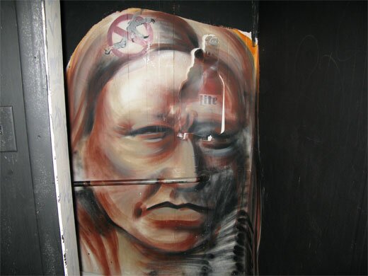
I’ve noticed this one for months (years?) on the access road to I-10:
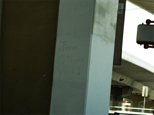
Also, a followup on Justin’s great street art find from a couple months ago. Apparently this is by the same artist (it’s in the men’s bathroom at the Voodoo Lounge, aka SWC Club):
Posted by justin on 24 Jul 2008 | Tagged as: art paparazzi, graffiti
(photo : James Ordner)
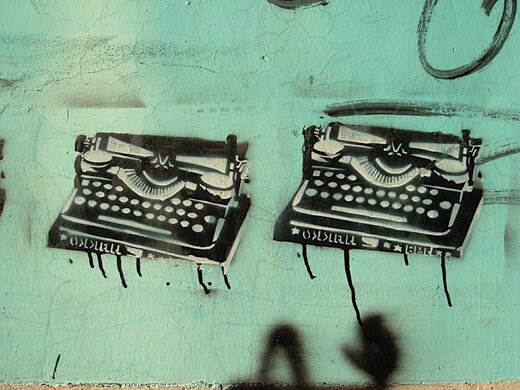
While my friend James spent some time in San Cristobal de las Casas last year, he took the time to document most instances of stencil graffiti that he came across. He has recently organized and uploaded it to this . Its worth a look. Awhile back, Michelle had highlighted a few of his images from his trip, but he had yet to post the entirety of what he had seen, hence the redundancy. Michelle also made the connection to some of the imagery we see on the streets of San Antonio from our local stencil hero “Scotch!“.
Posted by justin on 21 Jul 2008 | Tagged as: announcements, art + bikes, art paparazzi, borders, graffiti, in yo face
Posted by ben on 10 Jul 2008 | Tagged as: adventure day, design, graffiti, net.art, photography
An old friend sets out to chronicle New York City through its ATMs on a new blog, aptly titled :
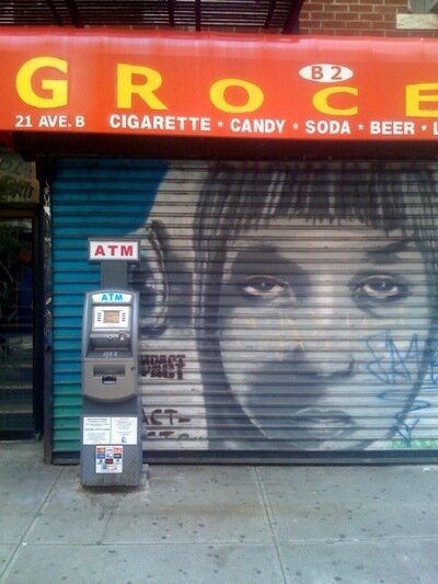
UPDATE: ATMNYC’s author writes:
The photos on atmnyc are taken with my iphone and then emailed directly to the tumblr blog. So the pictures are all snapped and posted in almost the same instant. I like to think of it as a sort of updated polaroid style. The limits of the iphone camera, the problems with focus, the tendency to blur and glare, even the dimensions of the photo, actually remind me a lot of the old Polaroid Land Camera.
I do not photograph any indoor atms unless they are visible from the street. I take many of the pictures quickly from my bike. I make little effort at composition— the city takes care of that part itself.
I used to hate the sight of atms, thinking that they were a regrettable intermediary techno clutter, not unlike the cell phone towers tacked onto so many historic Manhattan apartment buildings. On the other hand I find payphones charming, perhaps because they are nearing their obsolescence. Likewise, New York’s rooftop water towers are beautiful appendages, so maybe cellphone towers should be indulged as well.
In any case, I’ve become fond of atms, and have come to see them as helpful little droids, standing on corners blinking their senseless cyclopes eye, waiting patiently to serve the needs of a passing master– for a small fee, of course. In the meantime they are heaped with every abuse offered by graffiti, violence and the weather.
But despite my growing sentimentality for the things, I still get my cash from the teller at a local branch bank.
Posted by ben on 05 Jun 2008 | Tagged as: graffiti, photography, silliness
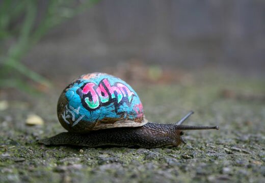
The lengths people go to to keep street art fresh (personally, I’m a bigger fan of the Indian Justin posted last week):
[via]
Posted by justin on 27 May 2008 | Tagged as: adventure day, art paparazzi, graffiti
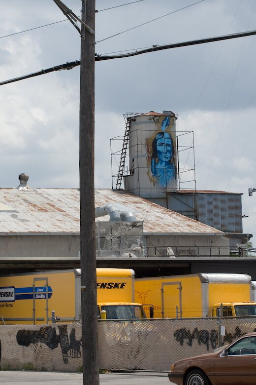
One of my favorite pieces of long-standing illegal graffiti in San Antonio, totally anonymous aside from the image itself, this large painting of a Native American Indian in feather headdress on the Sunshine Laundry building on South Flores has been catching my eye for some time. After asking around, I heard several stories of people who have purportedly met this person, painting the same Indian in other places, (bar bathrooms?) No info as to the artist identity (or given “street” name) has been found. This image is in plain sight of rush hour traffic going by Flores St. on I-35 in San Antonio (near San Pedro exit).
Posted by ben on 04 Feb 2008 | Tagged as: graffiti
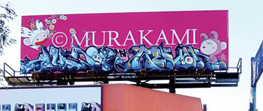
An interesting story out of LA, a bit like this tale from San Antonio, but with a happy ending:
Luckily, REVOK carried his camera that day, and L.A. Weekly received the photo; we were wowed. So, it turns out, was Murakami, whose Kaikai Kiki studio found the evidence via the Internet and had the billboard surreptitiously removed. Murakami buffing billboards all the way from Japan? On the contrary, according to his representatives, he found it “so wonderful, he had to have it for his collection.” Our billboard is now on its way to Tokyo.
(Hat tip: MAN)
Posted by ben on 08 Jan 2008 | Tagged as: design, essays, graffiti, responses/reviews, wordy
There’s a study making the rounds which investigates the connection between cultural consumption and social position. The findings are being trumpeted as “There’s no such thing as a cultural elite” — but this is a bit misleading. What the study finds is that first, cultural proclivities are determined by social status rather than social class (i.e. it’s more about your education and occupation than your tax bracket). Second, people tend to either seek out popular culture, or to seek out both popular and “high-brow” culture. The interesting point here is that there is no statistically significant group that pursues high-brow culture while shunning low-brow culture. So, for the most part, people are either passive consumers of culture (or “univores”), soaking up the popular types of music, theater, and art that surround them, or they are active consumers (or “omnivores”), spending time and energy pursuing the more rarefied art forms, while also enjoying the arts of the common man.
However, as the study notes, this “univore-omnivore” distinction gets a bit murky when it comes to the visual arts (there’s also another paper by the same authors that focuses specifically on the visual arts). If you clicked on the link at the beginning of this post, you probably noticed that the article in the Toronto Star suggests that the study finds that “the visual arts do not figure very high on anyone’s to-do list.” This is where things get complicated, and naturally, where the journalist gets lazy. The survey the study is based on asked about 6,000 people in Britain what kind of cultural events they attend, including things like rock concerts, jazz concerts, operas, movies, gallery openings, etc. In the visual arts, all five categories boil down to the question: how many museums, galleries, or art / craft fairs have you attended in the last 12 months? Those types of events that could be classified as popular (craft fairs and cultural festivals) actually received much lower attendance than those classified as high-brow (museums and galleries), and thus the “univore” group doesn’t really apply in this area.
The authors of the study also admit that they don’t have any data on home or street consumption of visual art (paintings, posters, graffiti, advertisements, or coffee table books). In a footnote they point to showing that in the working class home, most visual objects are either mementos or decorative objects, both of which are taken as “not artistic.” I think at this point we can begin to see the problem with these findings. Popular forms of visual art are practically defined out of existence, as cinema is grouped with theatrical arts, and all the graphic design, architecture, and other “decorative” elements that constantly surround us are taken to be something other than art. There are numerous ways to engage in visual culture besides going to galleries, museums, and craft fairs, none of which are captured by the dataset used for this study.
Posted by justin on 05 Jan 2008 | Tagged as: adventure day, art + bikes, art paparazzi, graffiti, in yo face, possibilities, r.i.p.
(words: Aaron Forland, photos: Justin Parr)
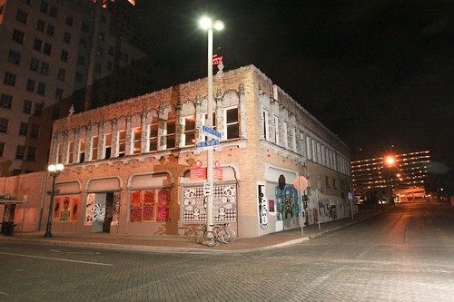
Who would have thought the day would come when the mighty Emvergeoning machine would get scooped on its home turf by a little-known upstart lowbrow/street art magazine called Juxtapoz? Not only that, but with photos we took, documenting a one-of-a-kind, one-night-only (thanks to our crack City maintenance crews – good lookin’ out, fellas) extralegal public art installation coordinated and executed by a group calling itself Uniting Artists Through Crime. Word has it that Scotch! and co-conspirators utilized the awesome networking power of to pull off this small coup. The diverse international show was mounted (after a false start one week prior) during daytime hours Monday, December 17th on the defunct, boarded-up former haven for the transient on North Saint Marys at Convent, directly across from our beautiful Greyhound Bus Station. As the press release (which also contained the magic word emerging) stated, the show ran “until the buff,” which, as mentioned, went down the following day. Fortunately, Fl!ght World Headquarters received a telephone tip late Monday night and we were able to semi-thoroughly document it in the wee morning hours.
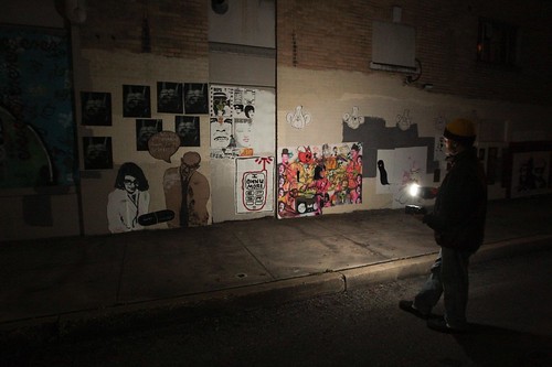
The show featured the work of artists from four continents, and may be the largest wheatpaste-based collaborative installation ever mounted in Texas. Standout works came from (Florida), New York City’s stencil-mad Bot, the sociopolitical stylings of (Malaysia), and San Antonio’s own fevered x-acto imagists and . Other contributing artists included (Califas), Aphro (SA), Bomit (Houston), Chis La Notte (Madrid, España), Dual (Houston), Dwell/Oneunit (NYC), Enosh (Califas), Enos One (SA), Genevieve (SA), (Queensland, Australia), Give Up (Houston), (SA), REPS/EPSR (SA), Washer (DC), Wes (SA) and probably a few others (apologies to anyone left out – I did my best to ID you all.) Media varied from traditional wheatpaste methods of xeroxed, screened or stenciled paper to hand-painted pieces and even stenciled metal plates.
Here you will find the entirety of Justin’s photos, and here are some supplementary celly snaps I took attempting to show a little more detail.
Posted by ben on 20 Dec 2007 | Tagged as: arts organizations, comics, graffiti, responses/reviews
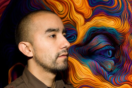
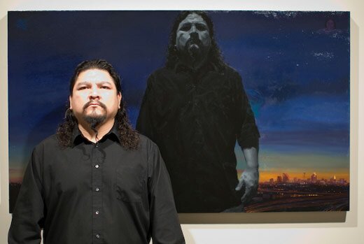
I feel bad for Alex Rubio. A month after his residency at Artpace ended, he had to put together a whole new exhibition of work for Museo Alameda. And although he pulled it off, the differences between the shows are revealing. Both exhibits are based around the idea of community; at Artpace, Rubio orchestrated an installation that combined the talents of local artists ranging from graffiti artist Shek to metal sculptor Luis Guerrero to neon and glass artist Cathy Cunningham; the Alameda mounted a two-person show by Rubio and his former student Vincent Valdez, which emphasized their shared history in San Anto (Rubio on the west side, Valdez on the south side). The Alameda show also brought in some community artists to accentuate the work with neon and sculpture, but remained primarily a showcase of the two artists’ paintings.
Let me start off by saying that both shows were successful, and anyone who hasn’t seen them yet should make the effort to drop by Artpace and the Alameda before they go down (the Artpace show runs through January 6, while the Alameda show closes March 23). At Artpace, Rubio orchestrated an installation that seamlessly blends the talents of a wide range of artists into a work that fits right into Rubio’s oeuvre. Organizing a community of artists around a singular vision is no easy task, and Alex Rubio pulled it off.
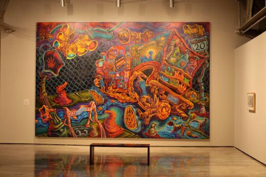
The Museo Alameda’s exhibit, curated by Benito Huerta, has a different goal: to juxtapose the work of two San Antonio artists with common yet divergent paths. The reason this show works is that the cinematic drama of Vincent Valdez’s work provides an effective counterpoint to the twisted, psychedelic visions of Alex Rubio. Both artists embrace the gritty reality of the streets in their native barrios, and bring into full view both the pride and the laments of their cultural heritage. Yet the divergent means through which they approach these realities tinges the community they depict with two distinct flavors. Valdez’s aesthetic could be drawn from the films of Scorsese, with their visceral impact and complex, yet direct, realism. At the same time, Valdez weaves a contemporary symbolism into his work, imbuing it with a sense of cultural depth. Rubio, on the other hand, seems to owe more to the psychedelic exploration of underground comics or even rock concert posters, while bringing this stylistic vocabulary to a new level of complexity and vibrant energy.
But when your eye drifts from the paintings, the rough edges start to become apparent. A huge map of San Antonio reminiscent of a pirate treasure map is prominently installed in the exhibit, highlighting the artists’ neighborhoods and showing the locations of significant events in their lives. Besides being difficult to read, this map, when at long last it is deciphered, brings very little to the paintings, which clearly convey a coherent experience of the world. Neon hands designed by Valdez forming the “signs” for the North, South, East and West sides feel tacked on; and a sculpture of the boxer in Valdez’s paintings lacks the emotional depth and formal strength of the original.
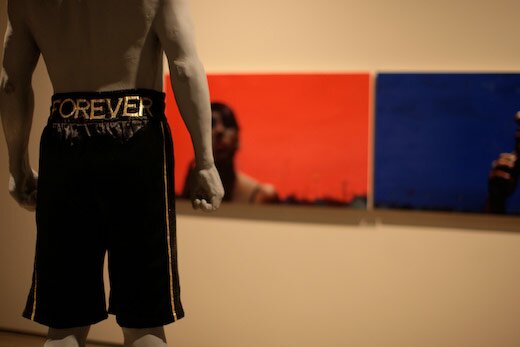
Still, this show is about the paintings, and the paintings succeed.
Posted by justin on 27 Nov 2007 | Tagged as: adventure day, art paparazzi, foamers, graffiti, outsider, silliness
Posted by michelle on 21 Aug 2007 | Tagged as: graffiti, opportunities
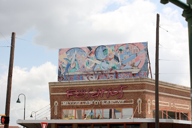
It’s time for someone to please bomb the billboard entranceway to Southtown. This is our neighborhood and Emvergeoning is publicly inviting you to paint something new on this old billboard. The previous artist, Mark Hogenson, has personally given the green light to cover up this fading mural. Supher, Clogged Caps, Illego…I challenge you to give this billboard new life. Ideally, this would be a monthly installation…