Fluid Branding
Posted by thomas-cummins on 23 Jan 2009 at 02:01 pm | Tagged as: design, typography
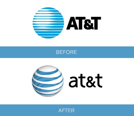
Ben’s link about Google’s philosophy towards a perpetually evolving brand is certainly a new corporate policy but logo evolution has always been around. San Antonio’s own AT&T morphed from an imposing Death Star logo to a more eco-friendly looking globe which the viewer can look down upon. Notice AT&T’s font also changed from the commanding CAPITALIZED letters to a more genial type.
at&t
My favorite is Starbucks’ logo though. The Seattle-based company started off with a traditional image of a mermaid but failed to realize she was nude and opening her legs for wandering sailors. I guess when you’re stuck on a boat with a bunch of men for months on end you begin to see women everywhere. As Starbucks grew into a blue chip Corporation they updated their obscene image by covering her breasts with her hair, cropping her legs off, and abstracting the entire image. Throughout the ages, the siren myth has always been a means for artists to portray how bodily impulses often lead us to disastrous results despite our better judgment. How fitting, then, that Starbucks similarly lures its customers in and convinces them to buy a $5 coffee despite their better judgment. How else does Starbucks make so much money just selling a drink? Because coffee is a legal drug.

Starbuck's Siren
יִשַׁי, Aloysius Stepinac, etal