typography
Archived Posts from this Category
Archived Posts from this Category
Posted by aaron on 15 Jun 2009 | Tagged as: coverage, design, music, rock!, typography

An apparently forged Sex Pistols flyer fools Christie’s authenticators and ignites controversy amongst internet rock’n'roll/design geeks.
As part of an ongoing project archiving San Antonio music flyers on my Facebook page, I have been frequenting the website Gigposters.com to comb through its San Antonio-related contributions. Early last week, I came across a singular new addition – the flyer pictured above, purporting to be from the Sex Pistols notorious Randy’s Rodeo concert in San Antonio on January 8, 1978. (Headline from the next day’s Express-News: “Pistols Win S.A. Shootout.”) The third date on the Sex Pistols short-lived American tour, it has gone down in punk rock lore as the concert at which Sid Vicious, after being repeatedly hit in the face with airborne full cans of beer, retaliated against the offending audience member’s head (and possibly innocent bystanders as well) using his bass guitar.
Posted by ben on 24 Mar 2009 | Tagged as: design, essays, typography
Emigre expands one of my favorite font families with some new faces that are better suited to longer texts:
One area where Mrs Eaves seems less comfortable is in the setting of long texts, particularly in environments such as the interiors of books, magazines, and newspapers. It seems to handle long texts well only if there is ample space. A good example is the book / CD / DVD release The Band: A Musical History published by Capitol Records. Here, Mrs Eaves was given appropriate set width and generous line spacing. In such cases its wide proportions provide a luxurious feel which invites reading. Economy of space was not one of the goals behind the original Mrs Eaves design. With the introduction of Mrs Eaves XL, Licko addresses this issue.
Read the whole thing for an interesting discussion of the development and refinement of this Baskerville revival. Baskerville himself is an interesting character, a master typographer / printer / binder / paper maker whose greatest work was the Baskerville Bible, despite the fact that he was an atheist who saw himself as advancing the cause of rationalism through his type designs.
Posted by thomas-cummins on 23 Jan 2009 | Tagged as: design, typography
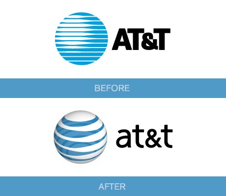
Ben’s link about Google’s philosophy towards a perpetually evolving brand is certainly a new corporate policy but logo evolution has always been around. San Antonio’s own AT&T morphed from an imposing Death Star logo to a more eco-friendly looking globe which the viewer can look down upon. Notice AT&T’s font also changed from the commanding CAPITALIZED letters to a more genial type.
at&t
My favorite is Starbucks’ logo though. The Seattle-based company started off with a traditional image of a mermaid but failed to realize she was nude and opening her legs for wandering sailors. I guess when you’re stuck on a boat with a bunch of men for months on end you begin to see women everywhere. As Starbucks grew into a blue chip Corporation they updated their obscene image by covering her breasts with her hair, cropping her legs off, and abstracting the entire image. Throughout the ages, the siren myth has always been a means for artists to portray how bodily impulses often lead us to disastrous results despite our better judgment. How fitting, then, that Starbucks similarly lures its customers in and convinces them to buy a $5 coffee despite their better judgment. How else does Starbucks make so much money just selling a drink? Because coffee is a legal drug.

Starbuck's Siren
Posted by ben on 09 Jul 2008 | Tagged as: design, typography
Here’s an interesting post putting handwriting samples of typographers up against their type designs:
Lately, I’ve been asking just one question, though. Something which has always intrigued me: these people that help us communicate … how do they themselves communicate? If we strip away the monitors, and the printing presses, and the typefaces … how would William Caslon have written on a post-it note?
Would have been interesting to see historical examples, such as John Baskerville and Nicolas Jenson, but it’s pretty cool nonetheless.
[hat tip]