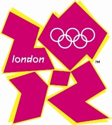
May Induce Seizures
Posted by michelle on 06 Jun 2007 at 05:57 pm | Tagged as: design, responses/reviews

Looks like we’re in for another Ugly Olympics over this seizure inducing, 1980s regurgitative graphic design defect. Yuck. I think the running joke tends to halo around the price tag for this “design”, deflating the British economy of some 45 million euros or something comparable. Eegads, makes the Valero logo look like pan dulce in comparison. Who are they hiring to create these hideous emblems? Post-ictal, color blind, Euclidean embracing pangolins? Perhaps.
O boy. I think you might try something that presents the location or where we are now i.e. Iraq, bad economies, global trade and shifts in population and wealth. A thought. Mike Hortens