responses/reviews
Archived Posts from this Category
Archived Posts from this Category
Posted by michelle on 24 Aug 2007 | Tagged as: art paparazzi, responses/reviews, sound art
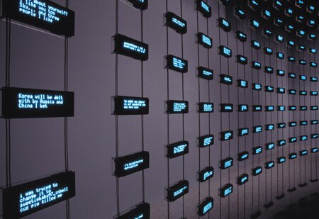
Mark Hansen and Ben Rubin sift through new media with a sharp and calculating statistician’s sensibility. The result, currently at Yerba Buena, leaves audiences reeling with the brainiac implications involved in such a complicated, perfectly orchestrated piece of musical, LED sublimeness. Here’s an example of the listening post in action at the Whitney in 2002.
Posted by ben on 21 Aug 2007 | Tagged as: r.i.p., responses/reviews
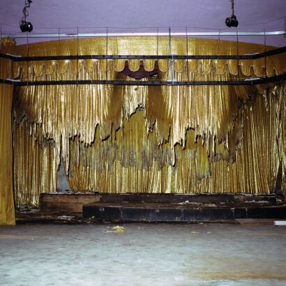
Back in March, i2i Gallery changed it’s name to Vtrue, and now it’s gone. There were hits and misses, as with any gallery, but Vtrue made a great contribution to the San Antonio art community, and will be missed. On the positive side, maybe this will give owners Gary Smith and Judith Cotrell more time to work on their own art. Emvergeoning covered two exhibits at i2i / Vtrue:
Now, of course, I wish we’d written more on their shows. But that’s how it goes. Mark Jones managed to document Vtrue’s swan song, Kerri Coar’s Sweet Tooth.
Posted by ben on 15 Aug 2007 | Tagged as: art paparazzi, arts organizations, responses/reviews
A few days ago a friend sent me this article reporting that stock in Sotheby’s dropped in value by over 11% in two days due to concerns that the super-duper rich are now only super rich, and won’t be buying as much art. That is to say, market performance in general impacts on the art market specifically. Now Todd Gibson, Tyler Green’s stand-in at Modern Art Notes, points out that the art market has been growing too quickly, and was due for a realignment anyway.
This is probably true, but in my opinion, the art market will continue on a long-term upward trend. As China becomes more liberalized, we will see its economy grow substantially, and a new upper-class elite, participating economically and culturally with the Western world, will start buying up more and more art. Similar trends could emerge in India and other countries as well.
But I’m also interested in what the economic situation does to the actual art. There has been concern lately that the overheated art market is leading us to a point where the art follows the money, rather than the other way around. The importance of critics and curators is ebbing as value is determined more by major private collectors than major art institutions. So if these concerns are valid, then perhaps a cooling of the market will lead to more meaningful work as the artists try to create markets rather than following them. It’ll be interesting to watch, in any case.
Posted by michelle on 10 Aug 2007 | Tagged as: art paparazzi, responses/reviews

The Dark Matters show at Yerba Buena Center for the Arts stunningly displays contemporary artworks that puncture complacency and give us a glimpse into clandestine military operations, death and starling migrations . Initially, I plotted an epic post full of everything I saw in San Francisco. However, the work was so different and so in depth that I’m just going to write reviews seriatim to keep things succinct and accessible.
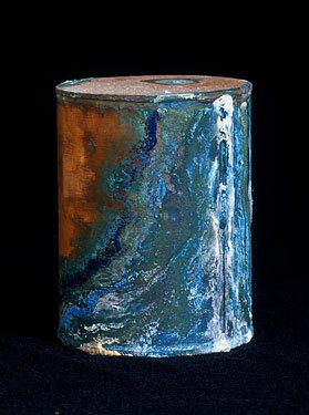
David Maisel is a photographer that I can’t stop thinking about. The artist’s initial interest stemmed from this question:
What happens to our bodies when we die? And, too, what happens to our souls?
These copper canisters contain the unclaimed remains of patients that inhabited the Oregon State Insane Asylum [in the days before euphemisms like "San Antonio State Hospital"]. Maisel said he was photographing the corroding urns when a prison worker assigned to clean up at the facility leaned into the room and whispered “The Library of Dust…”
Posted by michelle on 09 Aug 2007 | Tagged as: art paparazzi, graffiti, responses/reviews
This is the initial post on a series of artists I discovered at Yerba Buena Center for the Arts current Dark Matters exhibition. Joachim Schmid Selected Photo Works 1982-2007 is a mid-career retrospective for the Berlin based, self described “professional looker.” It features found photographs that the artist ripped, carefully framed or shredded and reconfigured like the postcard inspired example below.

Finding photographs at the largest flea market in Berlin, Schmid appropriates the dismissed evidence of other people’s artifacts. The shredded pieces reminded me of Jessica Barnett DeCuir’s cut up record album covers as well as the CutUp Collective occasionally documented on Wooster…You can read more about Schmid’s work in the companion monograph.
Posted by ben on 07 Aug 2007 | Tagged as: responses/reviews
[Note: this post is part 2 in a three-part series on the work of Alberto Mijangos. Part 1, on his Chones series, can be found here.]
Alberto Mijangos was not a religious man. Although his wife is active in her Episcopal church, even singing in the choir, Alberto always maintained a skeptical distance from organized religion of all kinds. This attitude towards religion went hand in hand with his distrust of authority and his wariness of tribalism. Yet in the mid-80s Alberto started working on what he called the “T-Shirt Series”, which explores the form of the T-shirt as it relates to the Christian cross. Having associated the cross with the grand cathedrals of Mexico City, where his grandmother took him as a child, this form helped Mijangos deal with both the grandiose and the quotidian. As a form on which to base an exploration of abstraction, it is perfect: simple and direct, yet still able to express the dual nature of man. At the same time, the t-shirt relates directly to the human figure, which is where Alberto had spent most of his time as an artist. More than anything, the image of the cross was a bridge for Alberto: it allowed him to confront the spiritual and the physical; the abstract and the representational.
His use of this image may have been inspired by the work of Antoni Tapies, whose paintings, which make extensive use of the cross, Alberto greatly admired. Like Tapies, Alberto began exploring the use of inexpensive, common materials with the t-shirt series. These paintings may include house paint, sand, wax, glue, fabric, or other found materials. Just as he used the common t-shirt to approach weighty ideas about human nature, he employed common materials to give an air of earthiness to transcendent imagery.
None of this, of course, was new in the 1980s. In fact, to begin exploring abstract expressionism and arte povera in 1985 could be considered rather quaint in an art world obsessed with the new and the shocking. And yet the power of these pieces, and the later Chones series which developed out of the T-shirt Series, is undeniable on a personal level, even if they have clear historical precedents. For in the process of exploring these techniques and styles, Alberto was not just exploring formal possibilities, but he was inhabiting and reinterpreting the philosophical foundations of de Kooning, Tapies, and others. It is a testament to the power of these ideas that they can bring real meaning and awareness to the life of a man who toiled in a spiritual void as a migrant farmer, a man who was deported for being a communist, although he never really believed in communism either. Here is a man who only believed in art, in the creative process. It was, for him, the only path to redemption. To put a mark on the canvas was in fact an act of supreme faith for Alberto — the only kind of faith he could understand.
And this faith involves real peril. As Martin Buber wrote — and I think this is as good a description of Alberto’s relationship with his art as any –
“The deed involves a sacrifice and a risk. The sacrifice: infinite possibility is surrendered on the altar of the form; all that but a moment ago floated playfully through one’s perspective has to be exterminated; none of it may penetrate into the work; the exclusiveness of such a confrontation demands this. The risk: the basic word can only be spoken with one’s whole being; whoever commits himself may not hold back part of himself; and the work does not permit me, as a tree or man might, to seek relaxation in the It-world; it is imperious: if I do not serve it properly, it breaks, or it breaks me.”
Posted by justin on 30 Jul 2007 | Tagged as: adventure day, art + bikes, art paparazzi, arts organizations, design, in yo face, mustaches, opportunities, party photos, performance art, possibilities, responses/reviews, rock!, silliness
Everybody has their own story about who won this year, Please post yours in the comments below.
All of these photos (and bunches more with labels) are located here.

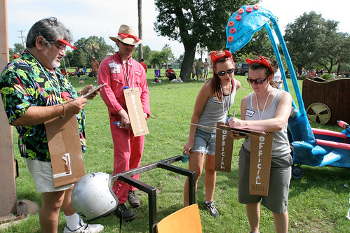
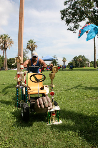

click on the link below for more action!
Posted by justin on 24 Jul 2007 | Tagged as: art paparazzi, bird flu, possibilities, responses/reviews, silliness, wordy
Posted by ben on 16 Jul 2007 | Tagged as: responses/reviews
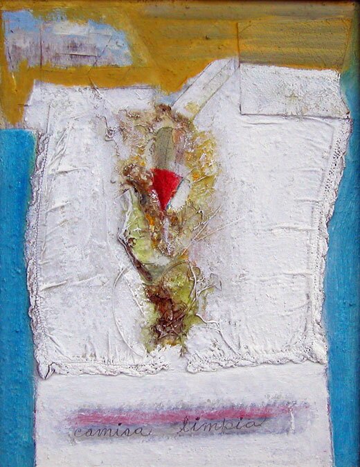
I’ve decided to do a series of three posts on Alberto Mijangos‘ work over the next week or so. This, the first, includes images of paintings from his “Chones” series. (For the gringos in the audience, that means “undies”.)
This series of paintings was a primary focus for Mijangos at the end of his life. Painting abstract underwear was a way for Mijangos to deal with the demagoguery, hypocrisy, and self-righteousness that pervades our politics (by “our politics” I mean the politics of the human race). These parts of our clothing that are most hidden and most easily soiled by embarrassing breaches in self-control, represent the obscure, dark side of the human personality; but at the same time, they represent a beautiful vulnerability and honesty. Here’s Mijangos discussing the Chones paintings in his 2003 interview with Smithsonian:
Well, it’s a situation about honesty, a situation about — communication with honesty, talking directly to another human being and really looking at that human being as a spiritual being, and to deal on those terms of I am talking to you with all my honesty and I’m talking to your spiritual being which is beautiful and perfection, and in that communication there’s an incredible experience of really, really admiring what creation is all about.
Sometimes I remember talking to my son and my son will look at me like his father and I would look at my son like my son. Not long ago my son, who is 40 years old, I went to him and I told him, I don’t know you as a human being. I know you as my son, but I want to know you as a human being. And he says, “I want to know you as a human being, too.” And our relationship changed incredible. Now we know each other spiritually and it’s no longer that situation about seeing objects or seeing a table like a table or seeing a cat like a cat. It’s totally different. We have that opportunity and we lose that because of what’s going on in the world, so we cover ourselves. We don’t want anybody to see our Chones.
Mijangos’ style of heavily layered expressionism allows him to convey basic forms that are simple and bold, but also imbued with the scuffs and marks of a complex personality that has lived in the world and is being revealed with honesty. These layers suggest the levels of experience, feeling, and thought that comprise a personality, and are expressed through the image of the underwear: the layer beneath the layer, which is itself stained and frayed. Coming up next: the T-Shirt Series.
(More images below the fold)
Posted by ben on 14 Jul 2007 | Tagged as: responses/reviews
Last night I made it out to Vtrue in time to catch whimsical but seamless ceramic sculptures by Pattie Chalmers. Drawing from fables and foibles, Chalmers’ cartoon-like characters are honest and simple without seeming trite. Mr. Disappointment (detail below) holds a bouquet of flowers and a lonesome visage, recalling an especially pathetic R. Crumb character.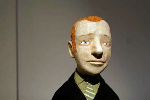
But the installation is filled with other characters, several of which radiate satisfaction. Gracie, on the opposite end of the stage from Mr. Disappointment, looks out at the observer with the newfound clarity of her glasses, eating honey sandwiches.
[Note: All photos in this post by Justin Parr]
Posted by michelle on 12 Jul 2007 | Tagged as: responses/reviews, sneak peeks
Winners were announced for the Photographic Center Northwest’s 12th Annual Photographic competition. Shuffling through some of the photographers’ websites, I found the stunning work of Brea Souders from the land of NYC. Souders spent some quality time in the Atacama Desert in Northern Chile as well as the decaying innards of a Catskills resort.
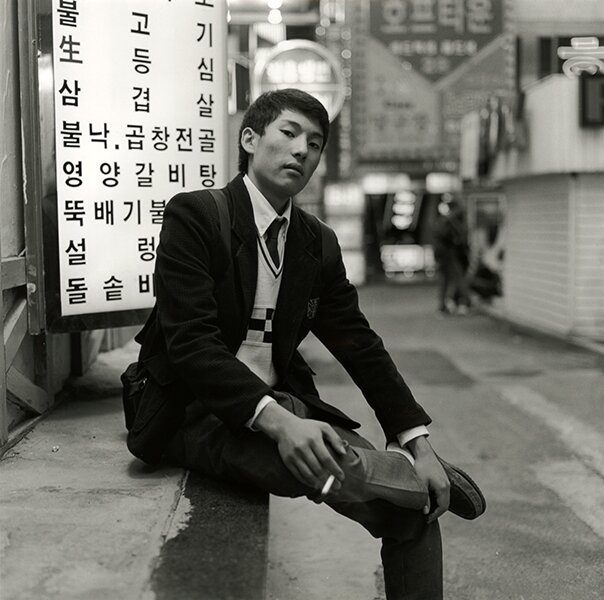
Congratulations to William Hundley in Austin for being the only Texan to win over the new Department Head and Curator of Photography at the Los Angeles County Museum of Art, Charlotte Cotton. Although much of the work she chose seems geared towards glossy fashion, a few cultivated interesting portfolios like Cat Gwynn [left] and Sung Jin Park [right]:

Posted by michelle on 09 Jul 2007 | Tagged as: responses/reviews
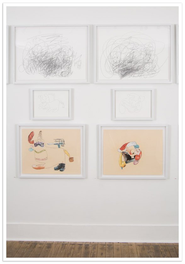
In case you can’t make it to Austin this month, here’s a sneak peek of new work from Sterling Allen at Art Palace. The exhibition perfectly encapsulates Allen’s keen ability to start with a mess of scribble clouds, untangle one free flowing line drawing and finally extract meticulously detailed phantasmagorias like this:
Posted by ben on 05 Jul 2007 | Tagged as: design, essays, possibilities, responses/reviews
Alice Twemlow, kicking off a piece for Design Observer, points us to a Very Short List post giddily discussing an album which is a soundtrack without a film. Very Short List concludes the post reeling with the possibilities: “Dazzling book jackets without novels inside; awesome stage sets on which actors never set foot; kick-ass magazine covers with no accompanying articles . . . we love the myriad possibilities of this new cart-before-the-horse genre.”
Of course, something like this has been done many times before: Brian Eno’s “” (a 1978 album featuring soundtracks for imaginary films); Stanislaw Lem’s “” (reviews of imaginary books) and “” (introductions to imaginary books); and yes, even Harland Miller’s covers for imaginary books. The Design Observer article focuses on poster art, and the relationship between the poster and the (sometimes fictitious) event or product being promoted. It moves from minimal Japanese poster artist Ten do Ten whose designs only use huge black and red pixels, to Richard Niessen’s “Kong” poster: “A mosaic built up from pixellated K’s, O’s, N’s and G’s and fusing the game-scapes of Donkey Kong and Pong to create an architectural setting for King Kong.” Definitely worth a read.
Posted by ben on 03 Jul 2007 | Tagged as: responses/reviews
Christopher Knight at the LA Times asks whether an as-yet-unrealized Felix Gonalez-Torres sculpture should have been chosen to represent the United States at the Venice Biennale (hat tip MAN). The two primary concerns are whether Gonzalez-Torres really needs the exposure, and whether it is appropriate for a curator to undertake the realization of a new work for which there are only notes and sketches. MAN took up the second issue back in early March, and asked Michelle Reyes to address it in a brief interview. According to Reyes, who is the director of the Felix Gonzalez-Torres Foundation and the Andrea Rosen Gallery:
This is fully formed, completely, no questions. But as per Felix’s working practice, there were parameters for the flexibility intrinsic to the work – there is a choice of two sizes and a choice of materials. As with the majority of Felix’s work, it will look different each time it is installed. There is no one true installation. This is one of the core aspects of the nature of all of Felix’s work.
If, as Sol LeWitt said, “the idea is a machine that makes the art,” there shouldn’t be any problem using the concept and sketches to realize a piece posthumously. But to what extent did Gonzalez-Torres subscribe to this idea of art-making? Although Gonzalez-Torres often built (endless) reproduction into the concept of his pieces (as in the piece Untitled (For Jeff), displayed around San Antonio on billboards to “welcome” the Alameda), and encouraged curator involvement in the production process, it is a question worth asking.
Posted by ben on 14 Jun 2007 | Tagged as: responses/reviews, tv, video/film

[Note: Yes, there are spoilers below.]
I wish I had something incredibly insightful to say about the conclusion of The Sopranos, but so much critical commentary is swirling around that it’s hard to feel like I can catch up with it all, much less make a contribution to the conversation.
Timothy Noah has a pretty good round-up of the current critical state of play over at Slate. I agree that the ending was nothing like City Lights (or The Graduate, for that matter); there was no epiphany, no resolution, not even an implied one. In some ways it revisited the endings of earlier seasons, with the intimate family dinner. In fact, A.J. makes a direct reference to the final lines of Season 1, while the family dined in Vesuvio’s during a rain storm (Tony: “I’d like to propose a toast, to my family. Someday soon, you’re gonna have families of your own, and if you’re lucky, you’ll remember the little moments, like this… that were good.”). In the final lines of Season 6, we are taken back to this moment:
Tony: It’s an entry level job. Buck up.
A.J.: Right, focus on the good times…
Tony: Don’t be sarcastic.
A.J.: Isn’t that what you said one time? Try and remember the times that were good?
Tony: I did?
A.J.: Yeah.
Tony: Well it’s true, I guess.
I think this reference is much more telling and meaningful than the “blackout” theory floating around. A lot of people wanted a resolution, and the ultimate resolution would be the death of Tony Soprano. But the show has never really been about that kind of resolution. It’s always been the resolution of finishing a day at work and having a few hours with your family before the next day begins.
So why the tense build-up and awkward drop-off of the final scene? Perhaps it’s a refusal to give us the comfort of an even remotely tidy ending. The show stopped not because the story was over, but because we can’t go on watching it forever (the last words we hear come from the Journey song playing on the jukebox: “Don’t stop…”). In this way, David Chase was able to succeed in conclusively not ending The Sopranos.
And he gave us all something to talk about.
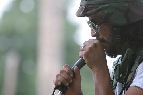
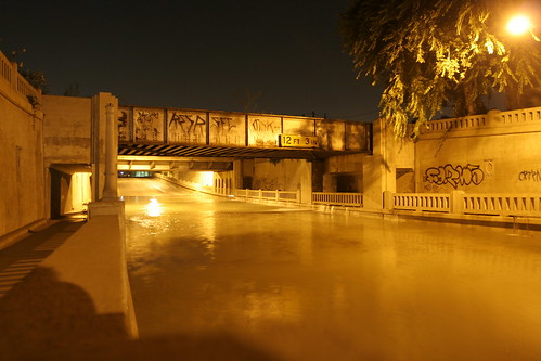
Posted by justin on 13 Jun 2007 | Tagged as: adventure day, art paparazzi, responses/reviews

*photo of flooding going on tonite under the bridge on Roosevelt near Brackenridge High School. It seems a water main broke up behind the location of the Mattress Factory and the Red Room, in the middle of the Railroad tracks. Water spilled out and filled the street, forcing Police to block the underpass for several hours. I stumbled on it by accident while out for a Bicycle adventure.

Posted by michelle on 06 Jun 2007 | Tagged as: design, responses/reviews

Looks like we’re in for another Ugly Olympics over this seizure inducing, 1980s regurgitative graphic design defect. Yuck. I think the running joke tends to halo around the price tag for this “design”, deflating the British economy of some 45 million euros or something comparable. Eegads, makes the Valero logo look like pan dulce in comparison. Who are they hiring to create these hideous emblems? Post-ictal, color blind, Euclidean embracing pangolins? Perhaps.
Posted by ben on 27 May 2007 | Tagged as: responses/reviews
I’ve been having an ongoing conversation with several friends involved to various degrees in the art world about the verbalization of art. I think I first became really aware of this phenomenon when I started going to Artpace openings. They require artists-in-residence to publicly discuss their work both at the beginning and at the end of the residency. In addition, the curator writes a few paragraphs about each resident’s installation which is posted on the web site and provided in pamphlet form by the entrance to each gallery. The effect of this prominent placement of explanatory remarks on the work is, in some cases, to create a fractured experience of art.
It’s a complicated problem, and probably one that I will be returning to, but I’d like to make a few comments on the effect of this tendency to wrap visual art in language. A lot of art critics have expressed distaste for “wall text” in museums and galleries. Two that I can think of off the top of my head are Dave Hickey and Tyler Green. I feel that the need to clothe visual expression in language distracts from the nature of the work — and forcing artists to write statements and discuss their work publicly has the perverse effect of rewarding artists for their verbal skills, when of course, the reason they became artists is usually because their ability to express themselves visually is stronger than their ability to express themselves verbally.
Historically, at least in America, the tendency to depend on verbal explanations of artwork seems to come with the rise of the Modernists. As noted in the Tyler Green post linked above, Alfred Barr pioneered the idea of using wall text at MoMA. Around the same time, it was Clement Greenberg, through his critical writing, who really shaped public perception of the work of Jackson Pollock, Willem de Kooning, Mark Rothko, and others. Not coincidentally, this the same time that visual art began to move more explicitly into the philosophical realm, a trend which became more and more prevalent up into the 1970s.
Last night I was discussing some of this with Kate Green, Artpace’s outgoing curator, and she pointed out that there really aren’t any art critics these days that have anywhere near the authority of Greenberg or Rosalind Krauss. In other words, the critics now seem to follow the trends determined by a robust art marketplace rather than creating those trends. The most recent major art critic to shape public perception of art we could think of was Dave Hickey, who I realized later, played an important role in marginalizing the critic. Hickey, along with Jeremy Gilbert-Rolfe and others, have advocated for a more aestheticized visual art, and pushed for a move away from the academic, conceptual art of the recent past. I think we are finally seeing the fruits of their labor; although in many settings (including Artpace) art is still packaged to some extent in linguistic trappings, this is beginning to seem more and more anachronistic.
Posted by michelle on 24 May 2007 | Tagged as: responses/reviews

Annie Simpson drew a lovely rendition of three sheets to the wind amidst a plethora of works for sale at Arthouse’s 5×7 fundraiser last week. The San Marcos based artist earned an MFA from Yale and participated in the first Texas Biennial but I haven’t seen too much of her other work. I love this drawing, I should have bought it. Everything is $100 and I highly recommend going to this show in Austin simply because this exhibition supports one of the best contemporary art spaces in Texas.
Posted by ben on 24 May 2007 | Tagged as: responses/reviews
Yesterday was San Antonio day over at Extreme Craft… filed under “Craft Extending its Middle Finger” and “Craft Masquerading as Art“.
Posted by michelle on 20 May 2007 | Tagged as: responses/reviews
What do Cai Guo Qiang, Joseph Beuys & Mircea Cantor have in common? Wolves and coyotes.
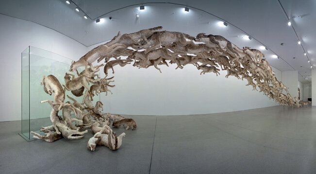
This installation inhabited Guggenheim Berlin late last year. It’s an astounding example of Cai Guo Qiang’s visions.

Mircea Cantor’s video installation in the Hudson Show Room at Artpace resonates with tension.
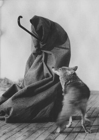
I Like America and America Likes Meat.
Posted by justin on 18 May 2007 | Tagged as: art paparazzi, in yo face, party photos, responses/reviews, rock!
Our Favorite San Antonio Art-rock icons Buttercup recently celebrated the release of an ep called “Captains of Industry.”
The show was a rousing bit of fun, following up with an amazing backmassage from a man wearing a t-shirt that said “300 lbs of poetry.” (Thank you Richard!)
Check out a mass of arty-rocky photos on this here fancy flickr doo-dad .
Heres a sneak preview :


Posted by michelle on 09 May 2007 | Tagged as: responses/reviews

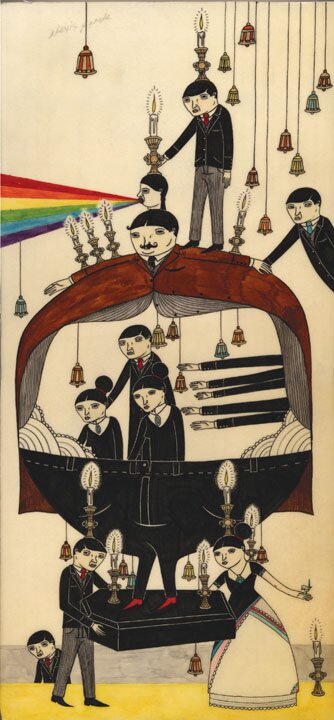
What happens when you elongate scenarios, severed limbs, or autobiographical narratives? Perhaps you discover fecund ground for future works. Richard Colman lives in a mellifluously ambiguous realm of rainbow-emesis induced lions, sharp dressed coxcombs and incongruent candelabras. He just finished his first book of drawings/paintings and opened a show of new work at Merry Karnowsky Gallery in the scintillating city of Los Angeles. Even better, he’s supposed to have a show later this year at Art Prostitute.
Posted by ben on 07 May 2007 | Tagged as: poetry, responses/reviews
Like all great poets, Li-Young Lee leans sensuality up against philosophy; he achieves intimacy from a distance. Virtually all of his poetry addresses the spaces between us that we are constantly trying to traverse. He deals as much with the space between a husband and wife sleeping next to each other (”am I inside you? he asks, lying between her legs, / confused about his heart, and his body. / If you don’t believe you’re inside me, you’re not / she answers, at peace with the body’s greed, / at peace with the heart’s confusion”) as the space between strangers in a train station (”Your attention please / train number seven, Leaves Blown By, / bound for the color of thinking / and renovated time, is now departing. / All ticketed passengers may board behind my eyes”). Paradoxically, it is by making us aware of these spaces, by drawing us into emptiness, that he is able to achieve that uniquely poetic intimacy.
His languorous reading style, too, is filled with empty spaces, places for breath to settle. When he speaks of Plato’s “Ladder of Love”, you feel that each line in the poem is a rung, bringing us up from the sensual to the spiritual by steps, without ever losing sight of where we began. Yet it is the spaces between the rungs where the movement happens. The rung is merely a place to rest before traversing the chasm between the body and the heart. And so with each line, Lee is merely preparing us for the silence that will follow it, where the breath will settle, where the movement occurs.
When I first saw one of Li-Young Lee’s readings, at Site Santa Fe in 2000, I couldn’t quite appreciate what he was doing; the slow pace led my mind to wander, rather than to dwell in emptiness. On Friday night, thanks to Gemini Ink, I had a chance to see him at the Coates chapel at the Southwest School of Art and Craft. Here I began to feel more fully how the sound of his voice is juxtaposed with silence, how his imagery pushes us to the edges of what we know.
It must be said that the acoustics in the chapel were very poor. It may be that the space does not lend itself to the PA system they had set up, and perhaps amplification muddied the voice. One result of this situation is that at times I gave up on understanding each word, and began to focus on the sounds, the timbre of Lee’s voice, and again, the way his voice plays off of the silence that surrounds it.
The reading lasted about 20 minutes, with six poems in all (”Station“, “To Life”, “Immigrant Blues“, “Hymn to Childhood”, “Trading for Heaven”, and “Virtues of the Boring Husband” (which is “very much autobiographical”)). Following the reading, Rose Catacalos collaborated with Bett Butler and Joël Dilley on jazz settings of Lee’s poetry. This was a combination of Catacalos reciting the work to the music (her reading style reminded me of Laurie Anderson on “Big Science”), and Bett Butler singing the work. My feeling is that the music detracted from the poetry by removing the silences, and by shifting the emotional landscape in a way that is at odds with Lee’s strengths as a poet. The sort of light, carefree jazz that Butler and Dilley tend to play just doesn’t mesh with the gravitas of Lee’s poetry.
So while it is a pleasure to see Li-Young Lee under any circumstance, this reading was not the best of circumstances. But despite these problems, Gemini Ink deserves credit for bringing authors of Lee’s caliber to San Antonio.
Posted by michelle on 01 May 2007 | Tagged as: responses/reviews
")
Myths ubiquitously emerge in everyday life, sometimes in television shows and oftentimes in idle scuttlebutt. Egyptian artstar, Basim Magdy, indulges in both myth and ubiquity with an installation at Okay Mountain and a contingent series of illustrations in the latest issue of Art Papers. Magdy manufactures a mis en scene with natural materials like sweet smelling mulch and bales of brittle hay and then places preternatural creatures into confined spaces. An Astronaut exists as a caged pet. One suicidal Sasquatch lays over a game of solitaire in a messy camper/trailer. You can’t see the shotgun next to the hirsute prop here, but you get the idea I guess. He could’ve worked on the sound element a bit more in depth. Maybe blasting ’s “Jailbreak” would’ve won me over, but that’s just asking for trouble. He should’ve put a diaper on the astronaut, or the sasquatch, or both. Is scatology in or out this year? Let’s have an Emvergeoning poll: Listen, nation, it’s time you exercised your freedom of choice! Any Miranda July references will be promptly deleted…))((
